Learning sharks-Share Market Institute

To know more about the Stock Market Courses Call Rajouri Garden 8595071711  or Noida 8920210950

What is Annual Report? Explained!

learning sharks

An annual report is a yearly report that every firm prepares in order to impress its shareholders. The annual report contains a wealth of information about a business, ranging from cash flow to management strategy.


Several people examine the annual report in order to assess the company’s solvency and financial situation.


Publicly traded companies publish annual reports to educate current and potential stockholders about the company’s activities and performance. They include discussions about the previous year’s activities, plans for the coming year(s), and financial information.


A stock analysis or decision to buy or sell a stock cannot be based just on reading annual reports. The purpose of a company’s annual report is to impress its shareholders. In the report, the company’s point of view is conveyed.


Investors should also consider issues that are not mentioned in annual reports, such as the company’s competitors, current stock price, sector outlook, and more.


What does the annual report tell you?


Annual reports are detailed publications that offer readers information about a company’s performance during the previous year. The reports include information such as performance highlights, a letter from the CEO, financial data, and future aims and ambitions.


Who uses the annual report?


Annual reports are frequently made public and address a wide external audience that includes shareholders, potential investors, employees, and customers. The general public can also be considered an audience, as some businesses or non-profit organisations will likely read another company’s annual report in order to better understand the latter’s beliefs and determine whether a partnership or other collaborative initiatives are feasible.


While annual reports are primarily used to provide financial and performance information, they are also used as an advertising tool to highlight some of the company’s key efforts or goals that have recently been achieved.


Shareholders and potential investors


Annual reports are used by shareholders and potential investors to gain a better knowledge of the company’s present status in order to make investment decisions. The annual report assists potential investors in deciding whether or not to buy stock. It also provides information on the company’s future plans, as well as its aims and objectives.


Employees


Employees frequently consult the annual report to gain a better understanding of a company’s many key areas. Many employees are also shareholders of a company, thanks in part to stock option perks and other schemes that incentivize staff to be shareholders.


Customers


Annual reports are used by customers to acquire an overview of different organisations and to assist them to determine which one to create a connection with. Customers want to engage with high-quality suppliers of products or services, and an annual report allows businesses to underline their basic values and objectives.


They also make effective use of the financial information in the annual report, which offers them a good picture of the company’s financial status.


Why is the annual report important to investors?


Companies create annual reports to bring shareholders up to date on how the business is doing. These reports feature financial data as well as information about the company’s culture, mission, and leadership.


Who prepares the annual report?


The Securities and Exchange Commission requires public corporations to produce detailed annual reports. Small firms and non-profit organisations, on the other hand, publish yearly reports in order to engage with customers and provide information about previous performance and future goals.


How do you create an annual report?


  • Every annual report is a chance to share what sets your company apart. …
  • Illustrate a Story. …
  • Use Photography Boldly. …
  • Bold photography can help balance longer blocks of text. …
  • Showcase Multimedia Elements. …
  • Adopt Multiple Formats. …
  • Opt for an Annual Report Infographic.


Think you can earn ₹5,00,000 in 2 weeks?

LEARNING SHARKS

Try trading for 30 days and see how much you can earn

“You are still not sure about online trading? I can assure you that it is profitable. Some of my new traders earn more than 170000 in their second week. Do you need additional proof? I dare you to attempt internet trading for 30 days and see how much money you can make. Do you agree to take on the challenge?”


Learn how to trade

We Are 100% Committed

To help and support you to generate more revenue

  • trading
  • Marketing Collaterals
  • Seminars & Events
  • Market research reports


Stock market course

India’s top online stock market learning platform  learning sharks for beginners, students, housewives, and professionals who want to learn to trade and invest in the stock market from the comfort of their own home or improve their abilities while studying for their diploma. Simple training classes with actual trade examples from experienced teachers, research analysts, and traders. You can become a professional trader and expert investor using simple approaches and strategies. Students from all around India are learning and pursuing professions in the financial sector, with decent pay and prospects. Get started now!


The most popular short-term courses in India for beginners to master the stock trading game, day trading methods, and share market psychology in a direct way.


This will assist you in learning how to trade stocks like an expert.


How Can Stock Market Training Help You?


Technical knowledge of Trends and Patterns is required to identify stock price changes. Assists in the development of a good trader with comprehensive knowledge of short-term, mid-term, and long-term investments. Trading strategies for reducing risk and increasing profits in the stock market.


What Will You Learn From Stock Market Courses?


  1. Research, Trading & Advisory (E-CRTA)
  2. Online Technical Analysis.
  3. Option Strategies.
  4. Currency and Commodities.
  5. Equity Research Analysis.
  6. Equity Valuation and Financial Modeling.
  7. Financial Planning & Wealth Management.
  8. Psychology and risk management


Feature of stock market

  • How To Get Started With Stock Market?
  • How To Use Stock Market Tools And Techniques?
  • How To Increase Profits?
  • How To Trade Stocks Confidently And Profitably?
  • What is Demat account / trading account


Why join learning sharks for the stock market?

The demand for professional tradespeople continues to rise. With the learning sharks increasing demand for stock market jobs, an increasing number of students are entering the securities market. Nevertheless, the money-making prospects provide home traders an excellent opportunity to supplement their income.
·       Learn how to make money in stock market
·       Reach your financial goals
·       Build real wealth
·       Set the right trading strategies
·       Reduce investment risk to avoid loss
·       Develop trading discipline essential for risk management

Who can get the benefit of a market course?

Companies understand the advantages of hiring an NSE BSE certified stock trader who can make informed decisions for wealth growth. However, the demand for stock brokers, financial planners, and investment consultants is valued by corporations looking for professionals to manage their company portfolios.


Thus, a trader with a superior understanding of stock market principles, tools, and procedures, as well as the correct investment approach, is a desirable prospect for a company.


It is essential to gain more expertise that will enhance your resume without spending any money.

All of volatility

Options

Background

After learning about Delta, Gamma, and Theta, we’re ready to dive into one of the most intriguing Options Greeks: Vega. Vega, as most of you may have surmised, is the rate of change of option premium in relation to volatility change. But the question is, what exactly is volatility? I’ve asked several traders this topic, and the most popular response is “Volatility is the up-and-down movement of the stock market.” If you share my views on volatility, it is past time we addressed this.

So here’s the plan; I’m guessing this will take several chapters –

  1. We will understand what volatility really means
  2. Understand how to measure volatility
  3. Practical Application of volatility
  4. Understand different types of volatility
  5. Understand Vega

So let’s get started.

Moneyball

Have you seen the Hollywood movie ‘Moneyball’? Billy Beane is the manager of a baseball team in the United States, and this is a true story. The film follows Billy Beane and his young colleague as they use statistics to uncover relatively unknown but exceptionally brilliant baseball players. A method unheard of at the time, and one that proved to be both inventive and revolutionary.

Moneyball’s trailer may be viewed here.

I enjoy this film not just because of Brad Pitt, but also because of the message it conveys about life and business. I won’t go into specifics right now, but let me draw some inspiration from the Moneyball technique to assist illustrate volatility:).

Please don’t be dismayed if the topic below appears irrelevant to financial markets. I can tell you that it is important and will help you better understand the phrase “volatility.”

Consider two batsmen and the number of runs they have scored in six straight matches –

MatchBillyMike
12045
22313
32118
42412
51926
62319

You are the team’s captain, and you must select either Billy or Mike for the seventh match. The batsman should be trustworthy in the sense that he or she should be able to score at least 20 runs. Who would you pick? According to my observations, people address this topic in one of two ways:

  1. Calculate both batsman’s total score (also known as ‘Sigma’) and select the batsman with the highest score for the following game. Or…
  2. Calculate the average (also known as ‘Mean’) amount of runs scored per game and select the hitter with the higher average.

Let us do the same and see what results we obtain –

  • Billy’s Sigma = 20 + 23 + 21 + 24 + 19 + 23 = 130
  • Mike’s Sigma = 45 + 13 + 18 + 12 + 26 + 19 = 133

So, based on the sigma, you should go with Mike. Let us compute the mean or average for both players and see who performs better –

  • Billy = 130/6 = 21.67
  • Mike = 133/6 = 22.16

Mike appears to be deserving of selection based on both the mean and the sigma. But don’t jump to any conclusions just yet. Remember, the goal is to select a player who can score at least 20 runs, and with the information we currently have (mean and sigma), there is no way to determine who can score at least 20 runs. As a result, let us conduct additional research.

To begin, we will compute the deviation from the mean for each match played. For example, we know Billy’s mean is 21.67 and that he scored 20 runs in his first encounter. As a result, the departure from the mean from the first match is 20 – 21.67 = – 1.67. In other words, he scored 1.67 runs below his average. It was 23 – 21.67 = +1.33 during the second match, which means he scored 1.33 runs more than his usual score.

Here is a diagram that represents the same thing (for Billy) –

learning sharks

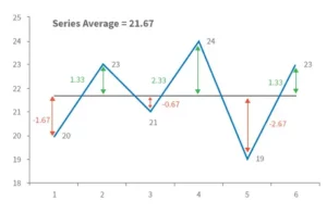
For each match played, the middle black line indicates Billy’s average score, while the double arrowed vertical line reflects his deviation from the norm. We shall now calculate another variable named ‘Variance.’

The sum of the squares of the deviation divided by the total number of observations is the definition of variance. This may appear to be frightening, but it is not. We know that the total number of observations in this situation is equal to the total number of matches played, so 6.

As a result, the variance may be computed as –

Variance = [(-1.67) ^2 + (1.33) ^2 + (-0.67) ^2 + (+2.33) ^2 + (-2.67) ^2 + (1.33) ^2] / 6
= 19.33 / 6
= 3.22

Further, we will define another variable called ‘Standard Deviation’ (SD) which is calculated as –

std deviation = √ variance 

So the standard deviation for Billy is –
= SQRT (3.22)
= 1.79

Similarly, Mike’s standard deviation equals 11.18.

Let’s add up all of the figures (or statistics) –

StatisticsBillyMike
Sigma130133
Mean21.622.16
SD1.7911.18

We understand what ‘Mean’ and ‘Sigma’ mean, but what about SD? The standard deviation represents the difference from the mean.

The textbook definition of SD is as follows: “The standard deviation (SD, also denoted by the Greek letter sigma, ) is a metric used in statistics to quantify the amount of variation or dispersion of a set of data values.”

Please do not mistake the two sigmas – the total is also known as sigma represented by the Greek symbol, and the standard deviation is also known as sigma represented by the Greek symbol.

PlayerLower EstimateUpper Estimate
Billy21.6 – 1.79 = 19.8121.6 + 1.79 = 23.39
Mike22.16 – 11.18 = 10.9822.16 + 11.18 = 33.34

These figures indicate that in the upcoming 7th match, Billy is likely to score between 19.81 and 23.39, while Mike is likely to score between 10.98 and 33.34. Mike’s range makes it difficult to predict whether he will score at least 20 runs. He can score 10, 34, or anything in between.

Billy, on the other hand, appears to be more consistent. His range is limited, thus he will neither be a power hitter nor a bad player. He is predicted to be consistent and should score between 19 and 23 points. In other words, picking Mike over Billy for the seventh match can be dangerous.

Returning to our initial question, who do you believe is most likely to score at least 20 runs? The answer must be obvious by now; it must be Billy. In comparison to Mike, Billy is more consistent and less hazardous.

So, in general, we used “Standard Deviation” to estimate the riskiness of these players. As a result, ‘Standard Deviation’ must indicate ‘Risk.’ In the stock market, volatility is defined as the riskiness of a stock or index. Volatility is expressed as a percentage and is calculated using the standard deviation.

Volatility is defined as “a statistical measure of the dispersion of returns for certain security or market index” by Investopedia. Volatility can be measured using either the standard deviation or the variance of returns from the same securities or market index. The bigger the standard deviation, the greater the risk.”

According to the aforementioned criterion, if Infosys and TCS have volatility of 25% and 45 percent, respectively, then Infosys has less dangerous price swings than TCS.

Some food for thought

Before I wrap this chapter, let’s make some predictions –
Today’s Date = 15th July 2015
Nifty Spot = 8547
Nifty Volatility = 16.5%
TCS Spot = 2585
TCS Volatility = 27%

Given this knowledge, can you forecast the anticipated trading range for Nifty and TCS one year from now?

Of course, we can, so let’s put the math to work –

AssetLower EstimateUpper Estimate
Nifty8547 – (16.5% * 8547) = 71368547 + (16.5% * 8547) = 9957
TCS2585 – (27% * 2585) = 18872585 + (27% * 2585) = 3282

So, based on the aforementioned calculations, Nifty is expected to trade between 7136 and 9957 in the next year, with all values in between having a varied likelihood of occurrence. This suggests that on July 15, 2016, the probability of the Nifty being around 7500 is 25%, while the probability of it being around 8600 is 40%.

This brings us to a fascinating platform –

  1. We estimated the Nifty range for a year; can we estimate the range Nifty is expected to trade in the next few days or the range Nifty is likely to trade up till the series expiry?
  2. If we can accomplish this, we will be in a better position to identify options that are likely to expire worthless, which means we can sell them now and pocket the premiums.
  3. We estimated that the Nifty will trade between 7136 and 9957 in the next year, but how certain are we? Is there any level of certainty in expressing this range?
  4. How is Volatility calculated? I know we talked about it previously in the chapter, but is there a simpler way? We could use Microsoft Excel!
  5. We computed the Nifty’s range using a volatility estimate of 16.5 percent; what if the volatility changes?

We’ll answer all of these topics and more in the next chapters!

Calculating Volatility in Excel

In the previous chapter, we discussed the notion of standard deviation and how it may be used to assess a stock’s ‘Risk or Volatility.’ Before we go any further, I’d like to discuss how volatility can be calculated. Volatility data is not easily accessible, therefore knowing how to compute it yourself is always a smart idea.

Of course, we looked at this calculation in the previous chapter (recall the Billy & Mike example), and we outlined the procedures as follows –

  1. Determine the average
  2. Subtract the average from the actual observation to calculate the variance.
  3. Variance is calculated by squaring and adding all deviations.
  4. Determine the standard deviation by taking the square root of the variance.

The goal of doing this in the previous chapter was to demonstrate the mechanics of standard deviation calculation. In my opinion, it is critical to understand what goes beyond a formula because it just increases your thoughts. However, in this chapter, we will use MS Excel to compute the standard deviation or volatility of a specific stock. MS Excel follows the identical processes as described previously, but with the addition of a button click.

I’ll start with the border steps and then go over each one in detail –

  1. Download historical closing price data.
  2. Determine the daily returns.
  3. Make use of the STDEV function.

So let us get started right now.

Step 1 – Download the historical closing prices

This may be done with any data source you have. The NSE India website and Yahoo Finance are two free and dependable data providers.

For the time being, I shall use data from the NSE India. At this point, I must tell you that the NSE’s website is pretty informative, and I believe it is one of the top stock exchange websites in the world in terms of information supplied.

Here is a snapshot where I have highlighted the search option –

learning sharks

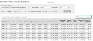
Once you have this, simply click on ‘Download file in CSV format (highlighted in the green box) and you’re done.

You now have the necessary data in Excel. Of course, in addition to the closing prices, you have a wealth of other information. I normally remove any unnecessary information and only keep the date and closing price. This gives the sheet a clean, crisp appearance.

Here’s a screenshot of my excel sheet at this point –

learning sharks

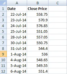
Please keep in mind that I have removed all extraneous material. I only kept the date and the closing prices.

Step 2 – Calculate Daily Returns

We know that the daily returns can be calculated as –

Return = (Ending Price / Beginning Price) – 1

However, for all practical purposes and ease of calculation, this equation can be approximated to:

Return = LN (Ending Price / Beginning Price), where LN denotes Logarithm to Base ‘e’, note this is also called ‘Log Returns’.

Here is a snapshot showing you how I’ve calculated the daily log returns of WIPRO –

learning sharks

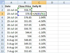
To calculate the lengthy returns, I utilized the Excel function ‘LN’.

Step 3 – Use the STDEV Function

After calculating the daily returns, you may use an excel function called ‘STDEV’ to calculate the standard deviation of daily returns, which is the daily volatility of WIPRO.

Note – In order to use the STDEV function all you need to do is this –

  1. Take the cursor an empty cell
  2. Press ‘=’
  3. Follow the = sign by the function syntax i.e STDEV and open a bracket, hence the empty cell would look like =STEDEV(
  4. After the open bracket, select all the daily return data points and close the bracket
  5. Press enter

Here is the snapshot which shows the same –

learning sharks

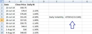
Once this is completed, Excel will quickly determine WIPRO’s daily standard deviation, often known as volatility. I receive 0.0147 as the answer, which when converted to a percentage equals 1.47 percent.

This means that WIPRO’s daily volatility is 1.47 percent!

WIPRO’s daily volatility has been estimated, but what about its annual volatility?

Now here’s a crucial rule to remember: to convert daily volatility to annual volatility, simply multiply the daily volatility value by the square root of time.

Similarly, to convert annual volatility to daily volatility, divide it by the square root of time.

So, we’ve estimated the daily volatility in this situation, and now we need WIPRO’s annual volatility. We’ll do the same thing here –

  • Daily Volatility = 1.47%
  • Time = 252
  • Annual Volatility = 1.47% * SQRT (252)
  • = 23.33%

In fact, I have calculated the same in excel, have a look at the image below –

learning sharks

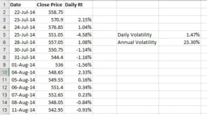
As a result, we know that WIPRO’s daily volatility is 1.47 percent and its annual volatility is approximately 23 percent.

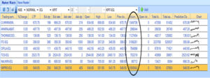
Let’s compare these figures to what the NSE has published on its website. The NSE only discloses these figures for F&O stocks and not for other stocks. Here is a screenshot of the same –

learning sharks

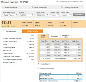
Our figure is very close to what the NSE has computed – according to the NSE, Wipro’s daily volatility is roughly 1.34 percent and its annualized volatility is about 25.5 percent.

So, what’s the deal with the minor discrepancy between our calculation and NSEs? – One probable explanation is that we use spot prices while the NSE uses futures prices. However, I’m not interested in delving into why this minor discrepancy exists. The goal here is to understand how to calculate the volatility of a security based on its daily returns.

Let us conduct one more calculation before we finish this chapter. If we know the annual volatility of WIPRO is 25.5 percent, how can we calculate its daily volatility?

As previously stated, to convert yearly volatility to daily volatility, simply divide the annual volatility by the square root of time, resulting in –

= 25.5% / SQRT (252)

= 1.60%

So far, we’ve learned what volatility is and how to calculate it. The practical use of volatility will be discussed in the following chapter.

Remember that we are still learning about volatility; however, the ultimate goal is to comprehend what the options Greek Vega signifies. Please don’t lose sight of our ultimate goal.

Background

We discussed previously the range within which the Nifty is likely to move given its yearly volatility. We estimated an upper and lower end range for Nifty and decided that it is likely to move inside that range.

Okay, but how certain are we about this? Is it possible that the Nifty will trade outside of this range? If so, what is the likelihood that it will trade outside of the range, and what is the likelihood that it will trade within the range? What are the values of the outside range if one exists?

Finding answers to these issues is critical for a number of reasons. If nothing else, it will create the groundwork for a quantitative approach to markets that is considerably distinct from the traditional fundamental and technical analysis thought processes.

So let us delve a little deeper to get our solutions.

Random Walk

The discussion that is about to begin is extremely important and highly pertinent to the matter at hand, as well as extremely interesting.

Consider the image below –

What you’re looking at is known as a ‘Galton Board.’ A Galton Board is a board with pins adhered to it. Collecting bins are located directly behind these pins.

The goal is to drop a little ball above the pins. When you drop the ball, it hits the first pin, after which it can either turn left or right before hitting another pin. The same method is repeated until the ball falls into one of the bins below.

Please keep in mind that once you drop the ball from the top, you will be unable to control its route until it lands in one of the bins. The ball’s course is fully spontaneous and not planned or regulated. Because of this, the path that the ball takes is known as the ‘Random Walk.’

Can you image what would happen if you dropped dozens of these balls one after the other? Each ball will obviously take a random walk before falling into one of the containers. What are your thoughts on the distribution of these balls in the bins?

  1. Will they all be grouped together? or
  2. Will they be spread evenly across the bins? or
  3. Will they fall into the various bins at random?

People who are unfamiliar with this experiment may be tempted to believe that the balls fall randomly across numerous bins and do not follow any particular pattern. But this does not occur; there appears to order here.

Consider the image below –

When you drop multiple balls on the Galton Board, each one taking a random walk, they all appear to be dispersed in the same way –

  1. The majority of the balls end up in the middle bin.
  2. There are fewer balls as you travel away from the middle bin (to the left or right).
  3. There are very few balls in the bins at the extreme ends.

This type of distribution is known as the “Normal Distribution.” You may have heard of the bell curve in school; it is nothing more than the normal distribution. The best aspect is that no matter how many times you perform this experiment, the balls will always be spread in a normal distribution.

This is a highly popular experiment known as the Galton Board experiment; I strongly advise you to watch this wonderful video to better comprehend this debate –

So, why are we talking about the Galton Board experiment and the Normal Distribution?

In reality, many things follow this natural sequence. As an example,

Collect a group of adults and weigh them – Separate the weights into bins (call them weight bins) such as 40kgs to 50kgs, 50kgs to 60kgs, 60kgs to 70kgs, and so on. Counting the number of people in each bin yields a normal distribution.

  1. If you repeat the experiment with people’s heights, you will get a normal distribution.
  2. With people’s shoe sizes, you’ll get a Normal Distribution.
  3. Fruit and vegetable weight
  4. Commute time on a specific route
  5. Lifetime of batteries

This list might go on and on, but I’d want to direct your attention to one more fascinating variable that follows the normal distribution – a stock’s daily returns!

The daily returns of a stock or an index cannot be forecast, which means that if you ask me what the return on TCS will be tomorrow, I will be unable to tell you; this is more akin to the random walk that the ball takes. However, if I collect the daily returns of the stock over a specific time period and examine the distribution of these returns, I can see a normal distribution, also known as the bell curve!

To emphasise this point, I plotted the distribution of daily returns for the following stocks/indices –

  • Nifty (index)
  • Bank Nifty ( index)
  • TCS (large cap)
  • Cipla (large cap)
  • Kitex Garments (small cap)
  • Astral Poly (small cap)

Normal Distribution

I believe the following explanation may be a little daunting for someone who is learning about normal distribution for the first time. So here’s what I’ll do: I’ll explain the concept of normal distribution, apply it to the Galton board experiment, and then extrapolate it to the stock market. I hope this helps you understand the gist better.

So, in addition to the Normal Distribution, different distributions can be used to distribute data. Different data sets are distributed statistically in different ways. Other data distribution patterns include binomial distribution, uniform distribution, Poisson distribution, chi-square distribution, and so on. Among the other distributions, the normal distribution pattern is arguably the most extensively studied and researched.

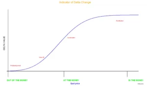
The normal distribution contains a number of qualities that aid in the development of insights into the data set. The normal distribution curve can be fully defined by two numbers: the mean (average) and standard deviation of the distribution.

The mean is the core value in which the highest values are clustered. This is the distribution’s average value. In the Galton board experiment, for example, the mean is the bin with the most balls in it.

So, if I number the bins from left to right as 1, 2, 3…all the way up to 9, the 5th bin (indicated by a red arrow) is the ‘average’ bin. Using the average bin as a guide, the data is distributed on either side of the average reference value. The standard deviation measures how the data is spread out (also known as dispersion) (recollect this also happens to be the volatility in the stock market context).

Here’s something you should know: when someone mentions ‘Standard Deviation (SD),’ they’re usually referring to the first SD. Similarly, there is a second standard deviation (2SD), a third standard deviation (SD), and so on. So when I say SD, I’m just referring to the standard deviation value; 2SD would be twice the SD value, 3SD would be three times the SD value, and so on.

Assume that in the Galton Board experiment, the SD is 1 and the average is 5. Then,

  • 1 SD would encompass bins between 4th bin (5 – 1 ) and 6th bin (5 + 1). This is 1 bin to the left and 1 bin to the right of the average bin
  • 2 SD would encompass bins between 3rd bin (5 – 2*1) and 7th bin (5 + 2*1)
  • 3 SD would encompass bins between 2nd bin (5 – 3*1) and 8th bin (5 + 3*1)

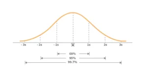
Keeping the preceding in mind, below is the broad theory surrounding the normal distribution that you should be familiar with –

  • Within the 1st standard deviation,
  • one can observe 68% of the data
  • Within the 2nd standard deviation, one can observe 95% of the data
  • Within the 3rd standard deviation, one can observe 99.7% of the data

The following image should help you visualize the above –


Using this to apply to the Galton board experiment –


  1. We can see that 68 percent of balls are collected within the first standard deviation, or between the fourth and sixth bins.
  2. We can see that 95 percent of balls are collected within the 2nd standard deviation, or between the 3rd and 7th bins.
  3. Within the third standard deviation, or between the second and eighth bins, 99.7 percent of balls are gathered.


Keeping the above in mind, imagine you are ready to drop a ball on the Galton board and we are both having a chat –


You – I’m about to throw a ball; can you guess which bin it will land in?


Me – No, I can’t since each ball moves at random. However, I can guess the range of bins it could fall into.


Can you forecast the range?


Me – I believe the ball will land between the fourth and sixth bins.


You – How certain are you about this?


Me-  I’m 68 percent certain it’ll fall somewhere between the fourth and sixth bins.


You – Well, 68 percent accuracy is a little low; can you predict the range with higher precision?


Me – Of course. I’m 95 percent certain that the ball will land in the third and seventh bins. If you want even more precision, I’d say the ball is most likely to land between the second and eighth bins, and I’m 99.5 percent certain of this.


You – Does it mean the ball has no chance of landing in the first or tenth bin?


Me – Well, there is a potential that the ball will land in one of the bins outside the third SD bins, but it is quite unlikely.


You – How low?


Me – The chances are about as slim as seeing a ‘Black Swan’ in a river. In terms of probability, the possibility is less than 0.5 percent.


You – Tell me more about the Black Swan


Me – Black Swan ‘events,’ as they are known, are events with a low likelihood of occurrence (such as the ball landing in the first or tenth bin). However, one should be aware that black swan events have a non-zero probability and can occur – when and how is difficult to anticipate. The image below depicts the occurrence of a black swan event –


There are many balls dropped in the above image, yet only a few of them collect at the extreme ends.


Normal Distribution and stock returns

Hopefully, the above explanation provided you with a brief overview of the normal distribution. The reason we’re discussing normal distribution is that the daily returns of stocks/indices also form a bell curve or a normal distribution. This suggests that if we know the mean and standard deviation of the stock return, we can have a better understanding of the stock’s return behaviour or dispersion. Let us examine the case of Nifty for the purposes of this debate.


To begin, the distribution of Nifty daily returns is as follows:


learning sharks


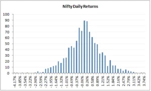
The daily returns, as we can see, are plainly distributed normally. For this distribution, I computed the average and standard deviation (in case you are wondering how to calculate the same, please do refer to the previous chapter). Remember that in order to get these figures, we must first compute the log daily returns.


  • Daily Average / Mean = 0.04%
  • Daily Standard Deviation / Volatility = 1.046%
  • The current market price of Nifty = 8337

Take note that an average of 0.04 percent shows that the nifty’s daily returns are concentrated at 0.04 percent. Now, keeping this knowledge in mind, let us compute the following:


  • The range within which Nifty is likely to trade in the next 1 year
  • The range within which Nifty is likely to trade over the next 30 days.

We will use 1 and 2 standard deviations meaning with 68 and 95 percent confidence for the computations above.


Solution 1 – (Nifty’s range for the next 1 year)


Average = 0.04%


SD = 1.046%


Let us convert this to annualized numbers –


Average = 0.04*252 = 9.66%


SD = 1.046% * Sqrt (252) = 16.61%


So with 68% confidence, I can say that the value of Nifty is likely to be in the range of –


= Average + 1 SD (Upper Range) and Average – 1 SD (Lower Range)


= 9.66% + 16.61% = 26.66%


= 9.66% – 16.61% = -6.95%


Because we computed this on log daily returns, these percent are log percentages, therefore we need to convert them back to regular percent, which we can do straight and get the range number (in relation to Nifty’s CMP of 8337) –

Upper Range


= 8337 *exponential (26.66%)


10841


And for lower range –


= 8337 * exponential (-6.95%)


7777


According to the foregoing forecast, the Nifty will most likely trade between 7777 and 10841. How certain am I about this? – As you know, I’m 68 percent certain about this.


Let’s raise the confidence level to 95% or the 2nd standard deviation and see what we get –


Average + 2 SD (Upper Range) and Average – 2 SD (Lower Range)


= 9.66% + 2* 16.61% = 42.87%


= 9.66% – 2* 16.61% = -23.56%


Hence the range works out to –


Upper Range


= 8337 *exponential (42.87%)


12800


And for lower range –


= 8337 * exponential


(-23.56%)


6587


The following computation implies that, with 95 percent certainty, the Nifty will move between 6587 and 12800 over the next year. Also, as you can see, when we seek higher accuracy, the range expands significantly.


I’d recommend repeating the task with 99.7 percent confidence or 3SD and seeing what kind of range figures you obtain.


Now, supposing you calculate Nifty’s range at 3SD level and get the lower range value of Nifty as 5000 (I’m just stating this as a placeholder number here), does this mean Nifty cannot go below 5000? It absolutely can, but the chances of it falling below 5000 are slim, and if it does, it will be considered a black swan occurrence. You can make the same case for the top end of the range.


Solution 2 – (Nifty’s range for next 30 days)


We know the daily mean and SD –


Average = 0.04%


SD = 1.046%


Because we want to calculate the range for the next 30 days, we must convert it for the appropriate time period –


Average = 0.04% * 30 = 1.15%


SD = 1.046% * sqrt (30) =


5.73%


So I can state with 68 percent certainty that the value of the Nifty during the next 30 days will be in the range of –


= Average + 1 SD (Upper Range) and Average – 1 SD (Lower Range)
= 1.15% + 5.73% = 6.88%
= 1.15% – 5.73% = – 4.58%


Because these are log percentages, we must convert them to ordinary percentages; we can do so right away and get the range value (in respect to the Nifty’s CMP of 8337) –


= 8337 *exponential (6.88%)


8930


And for lower range –


= 8337 * exponential (-4.58%)


7963


With a 68 percent confidence level, the above computation implies that Nifty will trade between 8930 and 7963 in the next 30 days.


Let’s raise the confidence level to 95% or the 2nd standard deviation and see what we get –


Average + 2 SD (Upper Range) and Average – 2 SD (Lower Range)


= 1.15% + 2* 5.73% = 12.61%


= 1.15% – 2* 5.73% = -10.31%


Hence the range works out to –


= 8337 *exponential (12.61%)


9457 (Upper Range)


And for lower range –


= 8337 * exponential (-10.31%)


7520


I hope the calculations above are clear to you. You may also download the MS Excel spreadsheet that I used to perform these computations.


Of course, you have a legitimate point at this point – normal distribution is fine – but how do I receive the information to trade? As a result, I believe this chapter is sufficiently long to accept further notions. As a result, we’ll transfer the application section to the next chapter. In the following chapter, we will look at the applications of standard deviation (volatility) and how they relate to trading. In the following chapter, we will go over two crucial topics: (1) how to choose strikes that can be sold/written using normal distribution and (2) how to set up stoploss using volatility.


Striking it right

The previous chapters have provided a basic understanding of volatility, standard deviation, normal distribution, and so on. We will now apply this knowledge to a few practical trading applications. At this point, I’d want to examine two such applications:

  1. Choosing the best strike to short/write
  2. Calculating a trade’s stop loss

However, at a much later stage (in a separate module), we will investigate the applications under a new topic – ‘Relative value Arbitrage (Pair Trading) and Volatility Arbitrage’. For the time being, we will only trade options and futures.


So let’s get this party started.


One of the most difficult problems for an option writer is choosing the right strike so that he may write the option, collect the premium, and not be concerned about the potential of the spot shifting against him. Of course, the risk of spot moving against the option writer will always present, but a careful trader can mitigate this risk.


Normal Distribution assists the trader in reducing this concern and increasing his confidence while writing options.


Let us quickly review –


learning sharks


According to the bell curve above, with reference to the mean (average) value –


  1. 68 percent of the data is clustered around the mean within the first SD, implying that the data has a 68 percent chance of being within the first SD.
  2. 95 percent of the data is clustered around the mean within the 2nd SD, which means that the data has a 95 percent chance of being within the 2nd SD.
  3. 99.7 percent of the data is clustered around the mean inside the third standard deviation, which means that there is a 99.7 percent chance that the data is within the third standard deviation.

Because we know that Nifty’s daily returns are typically distributed, the qualities listed above apply to Nifty. So, what does this all mean?


This means that if we know Nifty’s mean and standard deviation, we can make a ‘informed guess’ about the range in which Nifty is expected to move throughout the chosen time frame. Consider the following:


  • Date = 11th August 2015
  • Number of days for expiry = 16
  • Nifty current market price = 8462
  • Daily Average Return = 0.04%
  • Annualized Return = 14.8%
  • Daily SD = 0.89%
  • Annualized SD = 17.04%

Given this, I’d like to identify the range within which Nifty will trade till expiry, which is in 16 days –


16 day SD = Daily SD *SQRT (16)


= 0.89% * SQRT (16)


3.567%


16 day average = Daily Avg * 16


= 0.04% * 16 = 0.65%


These numbers will help us calculate the upper and lower range within which Nifty is likely to trade over the next 16 days –


Upper Range = 16 day Average + 16 day SD


= 0.65% + 3.567%


= 4.215%, to get the upper range number –


= 8462 * (1+4.215%)


8818


Lower Range = 16 day Average – 16 day SD


= 0.65% – 3.567%


= 2.920% to get the lower range number –


= 8462 * (1 – 2.920%)


8214


According to the calculations, the Nifty will most likely trade between 8214 and 8818. How certain are we about this? We know that there is a 68 percent chance that this computation will work in our favour. In other words, there is a 32% possibility that the Nifty will trade outside of the 8214-8818 range. This also implies that any strikes outside of the predicted range may be useless.


Hence –


  1. Because all call options over 8818 are expected to expire worthlessly, you can sell them and receive the premiums.
  2. Because they are likely to expire worthlessly, you can sell all put options below 8214 and receive the premiums.

Alternatively, if you were considering purchasing Call options above 8818 or Put options below 8214, you should reconsider because you now know that there is a very small possibility that these options would expire in the money, therefore it makes sense to avoid purchasing these strikes.


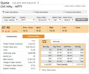
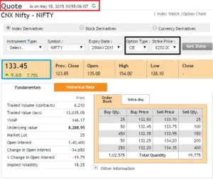
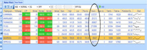
Here is a list of all Nifty Call option strikes above 8818 on which you can write (short) and get premiums –


learning sharks


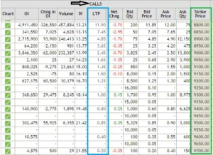
If I had to choose a strike today, it would be either 8850 or 8900, or possibly both, for a premium of Rs.7.45 and Rs.4.85 respectively. The reason I chose these strikes is straightforward: I saw a fair balance of danger (1 SD away) and return (7.45 or 4.85 per lot).


I’m sure many of you have had this thought: if I write the 8850 Call option and earn Rs.7.45 as premium, it doesn’t really translate to anything useful. After all, at Rs.7.45 for each lot, that works out to –


= 7.45 * 25 (lot size)


= Rs.186.25


This is precisely where many traders lose the plot. Many people I know consider gains and losses in terms of absolute value rather than return on investment.


Consider this: the margin required to enter this trade is approximate Rs.12,000/-. If you are unsure about the margin need, I recommend using Zerodha’s margin calculator.


The premium of Rs.186.25/- on a margin deposit of Rs.12,000/- comes out to a return of 1.55 percent, which is not a terrible return by any stretch of the imagination, especially for a 16-day holding period! If you can regularly achieve this every month, you may earn a return of more than 18% annualized solely through option writing.


I use this method to develop options and would like to share some of my ideas on it –


Put Options – I don’t like to short PUT options since panic spreads faster than greed. If there is market panic, the market can tumble considerably faster than you would think. As a result, even before you realise it, the OTM option you wrote may soon become ATM or ITM. As a result, it is preferable to avoid than to regret.


Call Options – If you reverse the preceding statement, you will realise why writing call options is preferable to writing put options. In the Nifty example above, for the 8900 CE to become ATM or ITM, the Nifty must move 438 points in 16 days. This requires excessive greed in the market…and as I previously stated, a 438 up move takes slightly longer than a 438 down move. As a result, I prefer to short solely call options.


Strike identification – I perform the entire operation of identifying the strike (SD, mean calculation, translating the same in relation to the number of days to expiry, picking the appropriate strike just the week before expiry and not earlier). The timing is deliberate.


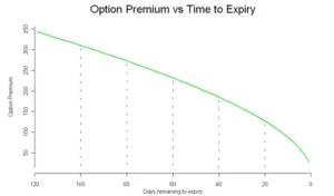
Timing – I only sell options on the last Friday before the expiry week. Given that the August 2015 series expiry is on the 27th, I’d short the call option only on the 21st of August, around the closing. Why am I doing this? This is mostly to make sure theta works in my advantage. Remember the ‘time decay’ graph from the theta chapter? The graph clearly shows that when we approach expiry, theta kicks in full force.


Premium Collected – Because I write call options so close to expiration, the premiums are always cheap. On the Nifty Index, the premium I get is roughly Rs.5 or 6, equating to a 1.0 percent return. But, for two reasons, I find the trade rather reassuring. (1) To have the trade operate against me (2) Theta works in my favour because premiums erode significantly faster during the last week of expiry, which benefits the option seller.


– Why bother? Most of you may be thinking, “With premiums this low, why should I bother?” To be honest, I had the same impression at first, however over time I understood that deals with the following criteria make sense to me –


  1. Risk and reward should be visible and quantifiable.
  2. If a transaction is profitable today, I should be able to reproduce it tomorrow.
  3. Consistency in identifying opportunities
  4. Worst-case scenario analysis

This technique meets all of the criteria listed above, hence it is my preferred option.


SD consideration – When I’m writing options 3-4 days before expiry, I prefer to write one SD away, but when I’m writing options much earlier, I prefer to go two SD away. Remember that the greater the SD consideration, the better your confidence level, but the lesser the premium you can receive. Also, as a general rule, I never write options that expire in more than 15 days.


Events – I avoid writing options when there are significant market events such as monetary policy, policy decisions, company announcements, and so on. This is due to the fact that markets tend to respond swiftly to events, and so there is a considerable probability of being caught on the wrong side. As a result, it is preferable to be safe than sorry.


Black Swan – I’m fully aware that, despite my best efforts, markets can shift against me and I could find myself on the wrong side. The cost of being caught on the wrong side, especially in this transaction, is high. Assume you receive 5 or 6 points as a premium but are caught on the wrong side and must pay 15 or 20 points or more. So you gave away all of the tiny gains you made over the previous 9 to 10 months in one month. In fact, the famous Satyajit Das describes option writing as “eating like a bird but pooping like an elephant” in his extremely incisive book “Traders, Guns, and Money.”


The only way to ensure that you limit the impact of a black swan occurrence is to be fully aware that it can occur at any point after you write the option. So, if you decide to pursue this technique, my recommendation is to keep an eye on the markets and evaluate market sentiment at all times. Exit the deal as soon as you see something is incorrect.


Option writing puts you on the edge of your seat in terms of success ratio. There are moments when it appears that markets are working against you (fear of a black swan), but this only lasts a short time. Such roller coaster sentiments are unavoidable when writing options. The worst aspect is that you may be forced to believe that the market is going against you (false signal) and hence exit a potentially profitable trade during this roller coaster ride.


In addition, I exit the transaction when the option moves from OTM to ATM.


Expenses – The key to these trades is to minimise your expenses to a minimal minimum in order to keep as much profit as possible for yourself. Brokerage and other fees are included in the costs. If you sell one lot of Nifty options and get Rs.7 as a premium, you will have to give up a few points as profit. If you trade with Zerodha, your cost per lot will be about 1.95. The greater the number of lots, the lower your cost. So, if I traded 10 lots (with Zerodha) instead of one, my expense drops to 0.3 points. To find out more, try Zerodha’s brokerage calculator.


The cost varies from broker to broker, so be sure your broker is not being greedy by charging you exorbitant brokerage fees. Even better, if you are not already a member of Zerodha, now is the moment to join us and become a part of our wonderful family.


Allocation of Capital – At this point, you may be wondering, “How much money do I put into this trade?” Do I put all of my money at danger or only a portion of it? How much would it be if it’s a percentage? Because there is no simple answer, I’ll use this opportunity to reveal my asset allocation strategy.


Because I am a firm believer in equities as an asset class, I cannot invest in gold, fixed deposits, or real estate. My whole money (savings) is invested in equities and equity-related items. Any individual should, however, diversify their capital across several asset types.


So, within Equity, here’s how I divided my money:


  1. My money is invested in equity-based mutual funds through the SIP (systematic investment plan) route to the tune of 35%. This has been further divided into four funds.
  2. 40% of my capital is invested in an equity portfolio of roughly 12 stocks. Long-term investments for me include mutual funds and an equity portfolio (5 years and beyond).
  3. Short-term initiatives will receive 25% of the budget.

The short-term strategies include a bunch of trading strategies such as –

  • Momentum-based swing trades (futures)
  • Overnight futures/options/stock trades
  • Intraday trades
  • Option writing


I make certain that I do not expose more than 35% of my total money to any single technique. To clarify, if I had Rs.500,000/- as my starting capital, here is how I would divide it:

  • 35% of Rs.500,000/- i.e Rs.175,000/- goes to Mutual Funds
  • 40% of Rs.500,000/- i.e Rs.200,000/- goes to equity portfolio
  • 25% of Rs.500,000/- i.e Rs.125,000/- goes to short term trading
  • 35% of Rs.125,000/- i.e Rs.43,750/- is the maximum I would allocate per trade
  • Hence I will not be


So this self-mandated rule ensures that I do not expose more than 9% of my overall capital to any particular short-term strategies including option writing.


Instruments – I prefer running this strategy on liquid stocks and indices. Besides Nifty and Bank Nifty, I run this strategy on SBI, Infosys, Reliance, Tata Steel, Tata Motors, and TCS. I rarely venture outside this list.


So here’s what I’d advise you to do. Calculate the SD and mean for Nifty and Bank Nifty on the morning of August 21st (5 to 7 days before expiry). Find strikes that are one standard deviation away from the market price and write them digitally. Wait till the trade expires to see how it happens. If you have the necessary bandwidth, you can run this over all of the stocks I’ve highlighted. Perform this diligently for a few expiries before deploying funds.


Finally, as a typical caveat, the concepts mentioned here suit my risk-reward temperament, which may differ greatly from yours. Everything I’ve said here is based on my own personal trading experience, these are not standard practices.


I recommend that you take notice of these points, as well as understand your personal risk-reward temperament and calibrate your plan. Hopefully, the suggestions above may assist you in developing that orientation.


This is directly contradictory to the topic of this chapter, but I must recommend that you read Nassim Nicholas Taleb’s “Fooled by Randomness” at this point. The book forces you to evaluate and reconsider everything you do in marketplaces (and life in general). I believe that simply being conscious of what Taleb writes in his book, as well as the actions you do in markets, puts you in an entirely different orbit.


Volatility based stoploss


This is a departure from Options, and it would have been more appropriate in the futures trading module, but I believe we are in the appropriate position to examine it.


The first thing you should do before starting any trade is to choose the stop-loss (SL) price. The SL, as you may know, is a price threshold beyond which you will not take any further losses. For example, if you buy Nifty futures at 8300, you may set a stop-loss threshold of 8200; you will be risking 100 points on this trade. When the Nifty falls below 8200, you exit the trade and take a loss. The challenge is, however, how to determine the right stop-loss level.


Many traders follow a typical technique in which they keep a fixed % stop-loss. For example, on each transaction, a 2% stop-loss could be used. So, if you buy a stock at Rs.500, your stop-loss price is Rs.490, and your risk on this transaction is Rs.10 (2 percent of Rs.500). The issue with this method is the practice’s rigidity. It does not take into account the stock’s daily noise or volatility. For example, the nature of the stock could cause it to fluctuate by 2-3% on a daily basis. As a result, you may be correct about the direction of the transaction but still hit stop-loss.’ Keeping such tight stops will almost always be a mistake.


Estimating the stock’s volatility is an alternative and effective way for determining a stop-loss price. The daily ‘anticipated’ movement in the stock price is accounted for by volatility. The advantage of this technique is that the stock’s daily noise is taken into account. The volatility stop is crucial because it allows us to establish a stop at a price point that is outside of the stock’s regular expected volatility. As a result, a volatility SL provides us with the necessary rational exit if the transaction goes against us.


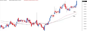
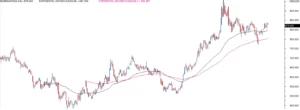
Let’s look at an example of how the volatility-based SL is implemented.


learning sharks


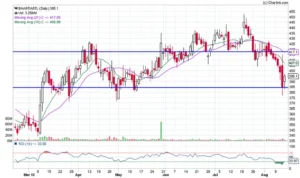
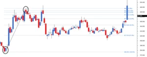
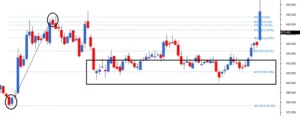
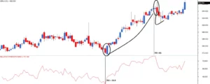
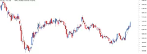
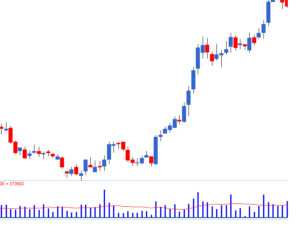
This is the chart of Airtel creating a bullish harami; those familiar with the pattern would recognise this as a chance to go long on the stock, using the previous day’s low (also support) as the stoploss. The immediate resistance would be the aim – both S&R sites are shown with a blue line. Assume you expect the trade to be completed during the next five trading sessions. The following are the trade specifics:

  • Long @ 395
  • Stop-loss @ 385
  • Target @ 417
  • Risk = 395 – 385 = 10 or about 2.5% below entry price
  • Reward = 417 – 385 = 32 or about 8.1% above entry price
  • Reward to Risk Ratio = 32/10 = 3.2 meaning for every 1 point risk, the expected reward is 3.2 point


From a risk-to-reward standpoint, this appears to be a smart trade. In fact, I consider any short-term transaction with a Reward to Risk Ratio of 1.5 to be a good trade. Everything, however, is dependent on the assumption that the stoploss of 385 is reasonable.


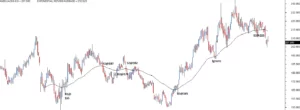
Let us run some numbers and delve a little more to see if this makes sense –


Step 1: Calculate Airtel’s daily volatility. I did the arithmetic, and the daily volatility is 1.8 percent.


Step 2: Convert daily volatility to volatility of the time period of interest. This is accomplished by multiplying the daily volatility by the square root of time. In our example, the predicted holding period is 5 days, hence the volatility is 1.8 percent *Sqrt (5). This equates to approximately 4.01 percent.


Step 3: Subtract 4.01 percent (5 day volatility) from the predicted entry price to calculate the stop-loss price. 379 = 395 – (4.01 percent of 395) According to the aforesaid calculation, Airtel can easily move from 395 to 379 in the next 5 days. This also implies that a stoploss of 385 can be readily overcome. So the stop loss for this trade must be a price point lower than 379, say 375, which is 20 points lower than the entry price of 395.


Step 4: With the updated SL, the RRR is 1.6 (32/20), which is still acceptable to me. As a result, I would be delighted to start the trade.


Note that if our predicted holding duration is 10 days, the volatility will be 1.6*sqrt(10), and so on.


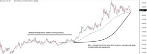
The daily movement of stock prices is not taken into account with a fixed % stop-loss. There is a good risk that the trader places a premature stop-loss, well within the stock’s noise levels. This invariably results in the stop-loss being hit first, followed by the target.


Volatility-based stop-loss accounts for all daily predicted fluctuations in stock prices. As a result, if we use stock volatility to set our stop-loss, we are factoring in the noise component and so setting a more relevant stop loss.


Theta

Time is money

Remember the proverb “Time is money?” It appears that this adage about time is really significant when it comes to options trading. For the time being, set aside all of the Greek jargon and return to a fundamental understanding of time. Assume you have registered for a competitive exam; you are an innately intelligent candidate with the ability to pass the exam; nevertheless, if you do not give it enough time and brush up on the ideas, you are likely to fail the exam; given this, what is the possibility that you will pass this exam? It all depends on how much time you spend studying for the exam, right? Let us put this in perspective and calculate the likelihood of passing the exam versus the time spent preparing for it.

Number of days for preparationLikelihood of passing
30 daysVery high
20 daysHigh
15 daysModerate
10 daysLow
5 daysVery low
1 dayUltra-low


Obviously, the more days you have to prepare, the more likely you are to pass the exam. Consider the following scenario while adhering to the same logic: If the Nifty Spot is 8500 and you buy a Nifty 8700 Call option, what is the probability that this call option will expire in the money (ITM)? Please allow me to rephrase this query –


  1. Given that the Nifty is currently at 8500, what is the possibility of the Nifty moving 200 points in the next 30 days, and thus the 8700 CE expiry ITM?
  2. The possibility of Nifty moving 200 points in the next 30 days is fairly high, hence the likelihood of an option expiring ITM at expiry is quite high.
  3. What if the time limit is only 15 days?
  4. Because it is fair to expect the Nifty to move 200 points over the following 15 days, the likelihood of an option expiring ITM at expiry is significant (notice it is not very high, but just high).
  5. What if the deadline is in 5 days?
  6. Well, 5 days, 200 points, not sure, therefore the probability of 8700 CE expiring in the money is low.
  7. What if you only had one day to live?
  8. The possibility of the Nifty moving 200 points in a single day is fairly low, so I would be reasonably convinced that the option would not expire in the money, so the chance is extremely low.

Is there anything we can deduce from the preceding? Clearly, the longer the period until expiry, the more likely the option will expire in the money (ITM). Keep this in mind when we move our attention to the ‘Option Seller.’ We understand that an option seller sells or writes an option and obtains a premium for it. When he sells an option, he is well aware that he is taking on an unlimited risk with a restricted profit possibility. The prize is only as large as the premium he receives. Only if the option expires worthless does he get to keep his entire payout (premium). Consider the following: – If he is selling an option early in the month, he is well aware of the following:


He is aware of his boundless risk and restricted profit possibilities.


He also understands that the option he is selling has a probability of converting into an ITM option, which means he will not be able to keep his payout (premium received)


In fact, because of ‘time,’ there is always the possibility that the option will expire in the money at any given point (although this chance gets lower and lower as time progresses towards the expiry date). Given this, why would an option seller want to sell options at all? After all, why would you want to sell options when you already know that the option you’re selling has a good chance of expiring in the money? Clearly, time is a risk in the context of option sellers. What if, in order to attract the option seller to sell options, the option buyer promises to compensate for the ‘time risk’ that he (the option seller) assumes?In such a circumstance, it seems reasonable to weigh the time risk versus the remuneration and make a decision, right? This is exactly what happens in real-world options trading. When you pay a premium for options, you are actually paying for –

  1. Time Risk
  2. The intrinsic value of options.


In other words, premium equals time value plus intrinsic value. Remember that we defined ‘Intrinsic Value’ earlier in this session as the money you would receive if you exercised your option today. To refresh your recollection, calculate the intrinsic value of the following options assuming the Nifty is at 8423 –

  1. 8350 CE
  2. 8450 CE
  3. 8400 PE
  4. 8450 PE

We know that the intrinsic value is always positive or zero and can never be less than zero. If the value is negative, the intrinsic value is regarded to be zero. We know that the fundamental value of Call options is “Spot Price – Strike Price” and that of Put options is “Strike Price – Spot Price.” As a result, the intrinsic values for the aforementioned choices are as follows:

  1. 8350 CE = 8423 – 8350 = +73
  2. 8450 CE = 8423 – 8450 = -ve value hence 0
  3. 8400 PE = 8400 – 8423 = -ve value hence 0
  4. 8450 PE = 8450 – 8423 = + 27

So, now that we know how to calculate an option’s intrinsic value, let us try to partition the premium and extract the time value and intrinsic value. Take a look at the following image –


learning sharks

Details to note are as follows –

  • Spot Value = 8531
  • Strike = 8600 CE
  • Status = OTM
  • Premium = 99.4
  • Today’s date = 6th July 2015
  • Expiry = 30th July 2015

Intrinsic value of a call option – Spot Price – Strike Price, i.e. 8531 – 8600 = 0 (due to the fact that it is a negative number) We already know that Premium = Time value + Intrinsic value. 99.4 + 0 = Time Value This means that the Time value is 99.4! Do you see what I mean? The market is willing to pay Rs.99.4/- for an option with no intrinsic value but plenty of temporal value! Remember that time is money. Here’s a look at the identical contract I signed the next day, July 7th –

learning sharks


The underlying value has increased somewhat (8538), while the option premium has reduced significantly! Let us divide the premium into its intrinsic and time values – Spot Price – Strike Price = 0 (since it is a negative value) We already know that Premium = Time value + Intrinsic value. 87.9 + 0 = Time Value This suggests that the Time value is 87.9! Have you seen the overnight decrease in premium value? We’ll find out why this happened soon. Note: In this example, the premium value decrease is 99.4 minus 87.9 = 11.5. This decrease is due to a decrease in volatility and time. In the following chapter, we shall discuss volatility.For the purpose of argument, assuming both volatility and spot remained constant, the decline in premium would be entirely due to time. This decline is likely to be around Rs.5 or so, rather than Rs.11.5/-. Consider another example:


learning sharks


  • Spot Value = 8514.5
  • Strike = 8450 CE
  • Status = ITM
  • Premium = 160
  • Today’s date = 7th July 2015
  • Expiry = 30th July 2015

We know – Premium = Time value + Intrinsic value 8514.5 – 8450 = 64.5 We know – Premium = Time value + Intrinsic value 160 = Time Value + 64.5 This means that the Time value is = 160 – 64.5 = 95.5. As a result, traders pay 64.5 percent of the total premium of Rs.160 for intrinsic value and 95.5 percent for time value. Repeat the computation for all options (calls and puts) and split the premium into time value and intrinsic value.


Movement of time

Time, as we know it, travels in just one way. Keep the expiry date as the objective time and consider the passage of time. Obviously, as time passes, the number of days till expiration decreases. Given this, let me ask you this question: If traders are willing to pay as much as Rs.100/- for time value with around 18 trading days to expiry, will they do the same if the time to expiry is only 5 days? Obviously, they would not, would they? With less time to expiry, traders will pay a lower price for time. In reality, here’s a snapshot from the previous months –


learning sharks


  • Date = 29th April
  • Expiry Date = 30th April
  • Time to expiry = 1 day
  • Strike = 190
  • Spot = 179.6
  • Premium = 30 Paisa
  • Intrinsic Value = 179.6 – 190 = 0 since it’s a negative value
  • Hence time value should be 30 paisa which equals the premium

With only one day till expiry, dealers are willing to pay a time value of 30 paise. However, if the period to expiry was more than 20 days, the time value would most likely be Rs.5 or Rs.8/-. The point I’m trying to make here is that as we approach closer to the expiry date, the time to expiry becomes less and shorter. This means that option buyers will be paying less and less for time value. So, if the option buyer pays Rs.10 as the time value today, he will most likely pay Rs.9.5/- as the time value tomorrow. This brings us to a critical conclusion: “All else being equal, an option is a depreciating asset.”The option’s premium depreciates on a daily basis, which is due to the passage of time.” The next natural issue is how much the premium would reduce on a daily basis due to the passage of time. Theta, the third option in Greek, can assist us answer this question.


Theta

As the expiration date approaches, the value of all options, including calls and puts, decreases. Theta, often known as the time decay factor, is the rate at which an option loses value over time. When all other factors remain constant, theta is stated as points lost per day. Because time moves in only one direction, theta is always a positive number; however, to remind traders that it represents a loss in option value, it is occasionally expressed as a negative number. A Theta of -0.5 suggests that the option premium will decrease by -0.5 points for each passing day. For example, if an option is trading at Rs.2.75/- with a theta of -0.05, it will trade the next day at Rs.2.70/- (provided other things are kept constant).A long option (option buyer) will always have a negative theta, which means that the option buyer will lose money on a daily basis, everything else being equal. Theta for a short option (option seller) will be positive. Theta is a pleasant Greek option seller. Remember that the option seller’s goal is to keep the premium. Given that options lose value on a daily basis, the option seller can benefit by keeping the premium until it loses value due to time. For example, if an option writer sells options at Rs.54 and a theta of 0.75, the identical option will most likely trade at – =0.75 * 3 = 2.25 = 54 – 2.25 = 51.75.As a result, the seller has the opportunity to terminate the position on T+ 3 day by purchasing it again at Rs.51.75/- and gaining Rs.2.25… and this is because of theta! Check out the graph below –


learning sharks


This graph depicts how the premium erodes as the expiry date approaches. This graph is also known as the ‘Time Decay’ graph. From the graph, we can see the following:

  1. The option loses little value in the beginning of the series, when there are several days till expiry. For example, when the option was 120 days away from expiry, it was trading at 350; yet, when the option was 100 days away from expiry, it was trading at 300. As a result, theta has little effect.
  2. As the series nears its end, theta has a strong influence. When there were 20 days to expiry, the option was trading around 150, but as we get closer to expiry, the loss in premium appears to increase (option value drops below 50).

So, if you sell options in the beginning of the series, you have the advantage of pocketing a huge premium value (because the time value is quite high), but keep in mind that the premium falls at a low pace. You can sell options closer to expiry for a reduced premium, but the premium decline is significant, which benefits the options seller. Theta is a simple and easy to comprehend Greek letter. We shall return to theta when we consider Greek cross-dependence. But, for the time being, if you understand everything that has been discussed here, you are ready to go. We will now proceed to comprehend the final and most intriguing Greek – Vega!


Conclusion

  1. Time risk is always paid for by option sellers.
  2. Intrinsic Value + Time Value Equals Premium
  3. All else being equal, options lose money every day because to Theta.
  4. Because time advances in only one direction, Theta is a positive number.
  5. Theta is a helpful Greek for option sellers.
  6. When you short naked options at the beginning of the series, you can pocket a significant time value, but the premium drop due to time is minimal.
  7. When you short an option near to expiry, the premium is low (because to time value), but the premium falls quickly.

Gamma

How many of you recall doing mathematics in high school? Do the terms differentiation and integration sound familiar? Back then, the term “derivatives” meant something else to all of us: it simply referred to solving long differentiation and integration problems.


Let me try to refresh your memory – the goal here is to simply get a point through without delving into the complexities of solving a calculus issue. Please keep in mind that the next topic is very significant to possibilities; please continue reading.

Consider the following:


A car gets started and travels for 10 minutes till it reaches the third-kilometer point. The car goes for another 5 minutes from the 3rd-kilometer point to the 7th-kilometer mark.


Let us focus and note what really happens between the 3rd and 7th kilometer, –

  1. Let ‘x’ = distance, and ‘dx’ the change in distance
  2. Change in distance i.e. ‘dx’, is 4 (7 – 3)
  3. Let ‘t’ = time, and ‘dt’ the change in time
  4. Change in time i.e. ‘dt’, is 5 (15 – 10)

If we divide dx over dt i.e. change in distance over change in time we get ‘Velocity’ (V)!

V = dx / dt

= 4/5


This means the car travels 4 kilometres every 5 minutes. The velocity is expressed in kilometres per minute here, which is clearly not a convention we use in everyday language because we are used to expressing speed or velocity in kilometres per hour (KMPH).


By performing a simple mathematical change, we can convert 4/5 to KMPH –


When stated in hours, 5 minutes = 5/60 hours; inserting this into the preceding equation

= 4 / (5/ 60)

= (4*60)/5

= 48 Kmph


Hence the car is moving at a velocity of 48 kmph (kilometers per hour).


Remember that velocity is defined as the change in distance travelled divided by the change in time. In the field of mathematics, speed or velocity is known as the ‘first order derivative’ of distance travelled.


Let us expand on this example: the car arrived at the 7th Kilometer after 15 minutes on the first leg of the voyage. Assume that in the second leg of the voyage, beginning at the 7th-kilometer mark, the car continues for another 5 minutes and arrives at the 15th-kilometer mark. 


We know the car’s velocity on the first leg was 48 kmph, and we can easily compute the velocity on the second leg as 96 kmph (dx = 8 and dt = 5).


The car clearly travelled twice as fast on the second portion of the excursion.


Let us refer to the change in velocity as ‘dv.’ Change in velocity is also known as ‘Acceleration.’


We know that the velocity change is


= 96KMPH – 48 KMPH

= 48 KMPH /??

The above response implies that the velocity change is 48 KMPH…. but over what? Isn’t it perplexing?


Allow me to explain:


** The following explanation may appear to be a digression from the main topic of Gamma, but it is not, so please continue reading; if nothing else, it will refresh your high school physics **


When you go to buy a new car, the first thing the salesman tells you is, “the car is incredibly quick since it can accelerate from 0 to 60 in 5 seconds.” Essentially, he is stating that the car can accelerate from 0 KMPH (total rest) to 60 KMPH in 5 seconds. The velocity change here is 60KMPH (60 – 0) in 5 seconds.


Similarly, in the above case, we know the difference in velocity is 48KMPH, but over what distance? We won’t know what the acceleration is unless we answer the “over what” question.


We can make several assumptions to determine the acceleration in this particular scenario –


Constant acceleration
For the time being, we can disregard the 7th-kilometer mark and focus on the fact that the car was at the 3rd-kilometer mark at the 10th minute and reached the 15th-kilometer mark at the 20th minute.


Using the preceding information, we can deduce further information (known as the ‘starting conditions’ in calculus).


  1. Velocity @ the 10th minute (or 3rd kilometer mark) = 0 KMPS. This is called the initial velocity
  2. Time lapsed @ the 3rd kilometer mark = 10 minutes
  3. Acceleration is constant between the 3rd and 15th kilometer mark
  4. Time at 15th kilometer mark = 20 minutes
  5. Velocity @ 20th minute (or 15th kilometer marks) is called ‘Final Velocity”
  6. While we know the initial velocity was 0 kmph, we do not know the final velocity
  7. Total distance travelled = 15 – 3 = 12 kms
  8. Total driving time = 20 -10 = 10 minutes
  9. Average speed (velocity) = 12/10 = 1.2 kmps per minute or in terms of hours it would be 72 kmph

Now think about this, we know –

  • Initial velocity = 0 kmph
  • Average velocity = 72 kmph
  • Final velocity =??

By reverse engineering we know the final velocity should be 144 Kmph as the average of 0 and 144 is 72.


Further we know acceleration is calculated as = Final Velocity / time (provided acceleration is constant).


Hence the acceleration is –


= 144 kmph / 10 minutes


10 minutes, when converted to hours, is (10/60) hours, plugging this back into the above equation


= 144 kmph / (10/60) hour

= 864 Kilometers per hour.


This means the car is gaining 864 kilometres per hour, and if a salesman were to sell you this car, he would state it can accelerate from 0 to 72kmph in 5 seconds (I’ll let you do the arithmetic).


We greatly simplified this problem by assuming that acceleration is constant. In fact, however, acceleration is not constant; you accelerate at varied rates for obvious reasons. To calculate such problems involving changes in one variable as a result of changes in another variable, one must first learn derivative calculus, and then apply the notion of ‘differential equations.


Just consider this for a bit –


Change in distance travelled (position) = Velocity, often known as the first order derivative of distance position.


Acceleration = Change in Velocity


Acceleration is defined as a change in velocity over time, which results in a change in position over time.


As a result, it is appropriate to refer to Acceleration as the 2nd order derivative of position or the 1st derivative of Velocity!


Keep this fact about the first and second-order derivatives in mind as we move on to understanding the Gamma.


Drawing Parallels

We learned about Delta of choice in the previous chapters. As we all know, delta reflects the change in premium for a given change in underlying price.


For example, if the Nifty spot price is 8000, we know the 8200 CE option is out-of-the-money, so its delta might be between 0 and 0.5. For the sake of this conversation, let’s set it to 0.2.


Assume the Nifty spot rises 300 points in a single day, which means the 8200 CE is no longer an OTM option, but rather a slightly ITM option. As a result of this increase in spot value, the delta of the 8200 CE will no longer be 0.2, but rather somewhere between 0.5 and 1.0.


One thing is certain with this shift in underlying: the delta itself changes. Delta is a variable whose value varies according to changes in the underlying and premium! Delta is extremely similar to velocity in that its value changes as time and distance are changed.

An option’s Gamma estimates the change in delta for a given change in the underlying. In other words, the Gamma of an option helps us answer the question, “What will be the equivalent change in the delta of the option for a given change in the underlying?”

 let us assume 0.8.


One thing is certain with this shift in underlying: the delta itself changes. Delta is a variable whose value varies according to changes in the underlying and premium! Delta is extremely similar to velocity in that its value changes as time and distance are changed.


An option’s Gamma estimates the change in delta for a given change in the underlying. In other words, the Gamma of an option helps us answer the question, “What will be the equivalent change in the delta of the option for a given change in the underlying?”


Let us now reintroduce the velocity and acceleration example and draw some connections to Delta and Gamma.


1st order Derivative

The change in distance travelled (position) with respect to time is recorded by velocity, which is known as the first order derivative of position.


Delta captures the change in premium with regard to the change in underlying, and so delta is known as the premium’s first order derivative.

2nd order Derivative


  1. Acceleration captures the change in velocity with respect to time, and acceleration is known as the 2nd order derivative of position.
  2. Gamma captures changes in delta with respect to changes in the underlying value; thus, Gamma is known as the premium’s second order derivative.

As you might expect, calculating the values of Delta and Gamma (and any other Option Greeks) requires a lot of number crunching and calculus (differential equations and stochastic calculus).


Here’s a fun fact for you: derivatives are so-called because the value of the derivative contract is determined by the value of the underlying.


This value that derivative contracts derive from their respective basis is assessed through the use of “Derivatives” as a mathematical notion, which is why Futures and Options are referred to as “Derivatives.”


You might be interested to hear that there is a parallel trading universe where traders use derivative calculus to locate trading opportunities on a daily basis. Such traders are known as ‘Quants’ in the trading world, which is a somewhat sophisticated term. Quantitative trading is what resides on the other side of the ‘Markets’ mountain.


Understanding the 2nd order derivative, such as Gamma, is not an easy process in my experience, however, we will try to simplify it as much as possible in the next chapters.


The Curvature

We now know that the Delta of an option is a variable because its value changes in response to changes in the underlying. Let me repost the delta movement graph here –


learning sharks

Looking at the blue line showing the delta of a call option, it is evident that it travels between 0 and 1, or possibly from 1 to 0, depending on the situation. Similar observations may be made on the red line indicating the delta of the put option (except the value changes from 0 to 1). This graph underlines what we already know: the delta is a variable that changes over time. Given this, the question that must be answered is –


  1. I’m aware of the delta changes, but why should I care?
  2. If the delta change is important, how can I estimate the likely delta change?

We’ll start with the second question since I’m very positive the answer to the first will become clear as we proceed through this chapter.


As discussed in the previous chapter, ‘The Gamma’ (2nd order derivative of premium), also known when the option’s curvature, is the rate at which the option’s delta varies as the underlying changes. The gamma is typically stated in deltas gained or lost per one-point change in the underlying, with the delta increasing by the gamma when the underlying rises and falling by the gamma when the underlying falls.

For example, consider this –


  • Nifty Spot = 8326
  • Strike = 8400
  • Option type = CE
  • Moneyness of Option = Slightly OTM
  • Premium = Rs.26/-
  • Delta = 0.3
  • Gamma = 0.0025
  • Change in Spot = 70 points
  • New Spot price = 8326 + 70 = 8396
  • New Premium =??
  • New Delta =??
  • New moneyness =??

Let’s figure this out –

  • Change in Premium = Delta * change in spot  i.e  0.3 * 70 = 21
  • New premium = 21 + 26 = 47
  • Rate of change of delta = 0.0025 units for every 1 point change in underlying
  • Change in delta = Gamma * Change in underlying  i.e  0.0025*70 = 0.175
  • New Delta = Old Delta + Change in Delta  i.e  0.3 + 0.175 = 0.475
  • New Moneyness = ATM

When the Nifty moved from 8326 to 8396, the 8400 CE premium increased from Rs.26 to Rs.47, and the Delta increased from 0.3 to 0.475.


The option switches from slightly OTM to ATM with a shift of 70 points. That indicates the delta of the choice must change from 0.3 to close to 0.5. This is exactly what is going on here.


Let us also imagine that the Nifty rises another 70 points from 8396; let us see what occurs with the 8400 CE option –

  • Old spot = 8396
  • New spot value = 8396 + 70 = 8466
  • Old Premium = 47
  • Old Delta = 0.475
  • Change in Premium = 0.475 * 70 = 33.25
  • New Premium = 47 + 33.25 = 80.25
  • New moneyness = ITM (hence delta should be higher than 0.5)
  • Change in delta =0.0025 * 70 = 0.175
  • New Delta = 0.475 + 0.175 = 0.65

Let’s take this forward a little further, now assume Nifty falls by 50 points, let us see what happens with the 8400 CE option –

  • Old spot = 8466
  • New spot value = 8466 – 50 = 8416
  • Old Premium = 80.25
  • Old Delta = 0.65
  • Change in Premium = 0.65 *(50) = – 32.5
  • New Premium = 80.25 – 32. 5 = 47.75 
  • New moneyness = slightly ITM (hence delta should be higher than 0.5)
  • Change in delta = 0.0025 * (50) = – 0.125
  • New Delta = 0.65 – 0.125 = 0.525

Take note of how smoothly the delta transitions and follows the delta value principles we learned in previous chapters. You may also be wondering why the Gamma value is kept constant in the preceding samples. In reality, the Gamma also changes as the underlying changes. This change in Gamma caused by changes in the underlying is recorded by the 3rd derivative of the underlying, which is known as “Speed” or “Gamma of Gamma” or “DgammaDspot.” For all practical reasons, it is unnecessary to discuss Speed unless you are mathematically inclined or work for an Investment Bank where the trading book risk can be in the millions of dollars.


In contrast to the delta, the Gamma is always positive for both Call and Put options. When a trader is long options (both calls and puts), he is referred to as a ‘Long Gamma,’ and when he is short options (both calls and puts), he is referred to as a ‘Short Gamma.’


Consider this: the Gamma of an ATM Put option is 0.004, what do you believe the new delta is if the underlying moves 10 points?

Before you proceed, I would like you to take a few moments to consider the above solution.

The solution is as follows: Because we are discussing an ATM Put option, the Delta must be approximately -0.5. Remember that put options have a negative delta. As you can see, gamma is a positive number, i.e. +0.004. Because the underlying moves by 10 points without stating the direction, let us investigate what happens in both circumstances.


Case 1 – Underlying moves up by 10 points

  • Delta = – 0.5
  • Gamma = 0.004
  • Change in underlying = 10 points
  • Change in Delta = Gamma * Change in underlying = 0.004 * 10 = 0.04
  • New Delta = We know the Put option loses delta when underlying increases, hence – 0.5 + 0.04 = – 0.46

Case 2 – Underlying goes down by 10 points

  • Delta = – 0.5
  • Gamma = 0.004
  • Change in underlying = – 10 points
  • Change in Delta = Gamma * Change in underlying = 0.004 * – 10 = – 0.04
  • New Delta = We know the Put option gains delta when underlying goes down, hence – 0.5 + (-0.04) = – 0.54

Here’s a trick question for you: We’ve already established that the Delta of a Futures contract is always 1, therefore what do you believe the gamma of a Futures contract is? Please share your responses in the comment section below:).


Estimating Risk using Gamma

I know that many traders set risk limitations while trading. Here’s an illustration of what I mean by a risk limit: suppose a trader has Rs.300,000/- in his trading account. Each Nifty Futures contract requires a margin of roughly Rs.16,500/-. Please keep in mind that you can utilise Zerodha’s SPAN calculator to determine the margin necessary for any F&O contract. So, taking into account the margin and the M2M margin necessary, the trader may decide at any point that he does not want to hold more than 5 Nifty Futures contracts, thereby establishing his risk limitations; this seems reasonable and works well when trading futures.

Does the same rationale apply when trading options? Let’s see if this is the correct way to think about risk when trading options.


Consider the following scenario:


Lot size = 10 lots traded (Note: 10 lots of ATM contracts with 0.5 delta each equals 5 Futures contracts.)

  • Number of lots traded = 10 lots (Note – 10 lots of ATM contracts with a delta of 0.5 each is equivalent to 5 Futures contracts)
  • Option = 8400 CE
  • Spot = 8405
  • Delta = 0.5
  • Gamma = 0.005
  • Position = Short

The trader is short 10 lots of Nifty 8400 Call Option, indicating that he is trading within his risk tolerance. Remember how we talked about adding up the delta in the Delta chapter? To calculate the overall delta of the position, we can simply add up the deltas. Furthermore, each delta of one indicates one lot of the underlying. So we’ll keep this in mind and calculate the delta of the overall position.

  • Delta = 0.5
  • Number of lots = 10
  • Position Delta = 10 * 0.5 = 5

So, in terms of overall delta, the trader is within his risk limit of trading no more than 5 Futures lots. Also, because the trader is short options, he is effectively short gamma.


The delta of the position is 5, which means that the trader’s position will move 5 points for every 1 point movement in the underlying.


Assume the Nifty moves 70 points against him and the trader maintains his position, looking for a recovery. The trader clearly believes that he is holding 10 lots of options, which are within his risk tolerance…


Let’s do some forensics to figure out what’s going on behind the scenes –

  • Delta = 0.5
  • Gamma = 0.005
  • Change in underlying = 70 points
  • Change in Delta = Gamma * change in underlying = 0.005 * 70 = 0.35
  • New Delta = 0.5 + 0.35 = 0.85
  • New Position Delta = 0.85*10 = 8.5

Do you see the issue here? Despite having set a risk limit of 5 lots, the trader has exceeded it due to a high Gamma value and now owns positions worth 8.5 lots, much above his perceived risk limit. An inexperienced trader may be taken off guard by this and continue to believe he is well below his danger threshold. In actuality, his risk exposure is increasing.


Suggest you read that again in small bits if you found it confusing.


But since the trader is short, he is essentially short gamma…this means when the position moves against him (as in the market moves up while he is short) the deltas add up (thanks to gamma) and therefore at every stage of market increase, the delta and gamma gang up against the short option trader, making his position riskier way beyond what the plain eyes can see. Perhaps this is the reason why they say – shorting options carry a huge amount of risk. In fact, you can be more precise and say “shorting options carry the risk of being short gamma”.


Note – By no means I’m suggesting that you should not short options. In fact, a successful trader employs both short and long positions as the situation demands. I’m only suggesting that when you short options, you need to be aware of the Greeks and what they can do to your positions.


Also, I’d strongly suggest you avoid shorting option contracts which has a large Gamma.


This leads us to another interesting topic – what is considered a ‘large gamma’.


Gamma movement

We briefly examined the Gamma changes in relation to the change in the underlying earlier in the chapter. The 3rd order derivative named ‘Speed’ captures this shift in Gamma. For the reasons stated previously, I will refrain from discussing ‘Speed.’ However, we must understand the behaviour of Gamma movement in order to prevent beginning trades with high Gamma. Of course, there are other benefits to understanding Gamma behaviour, which we shall discuss later in this lesson. But for now, we’ll look at how the Gamma reacts to changes in the underlying.


Take a look at the graph below.

learning sharks


The chart above depicts three alternative CE strike prices – 80, 100, and 120 – as well as their corresponding Gamma movement. The blue line, for example, represents the Gamma of the 80 CE strike price. To minimise misunderstanding, I recommend that you examine each graph separately. In actuality, for the sake of clarity, I will only discuss the 80 CE strike option, which is represented by the blue line.


Assume the spot price is at 80, resulting in the ATM at 80. Keeping this in mind, we can see the following from the preceding chart –


  1. Because the strike under consideration is 80 CE, the option becomes ATM when the spot price equals 80 CE.
  2. Strike values less than 80 (65, 70, 75, etc.) are ITM, while values more than 80 (85, 90, 95, etx) are OTM.
  3. The gamma value for OTM Options is low (80 and above). This explains why the premium for OTM options does not change substantially in absolute point values but changes significantly in percentage terms. For example, the premium of an OTM option can rise from Rs.2 to Rs.2.5, and while the absolute change is only 50 paisa, the percentage change is 25%.
  4. When the option reaches ATM status, the gamma increases. This suggests that the rate of change of delta is greatest when ATM is selected. In other words, ATM options are particularly vulnerable to changes in the underlying.
  5. Also, avoid shorting ATM options because they have the biggest Gamma.
  6. The gamma value for ITM options is also low (80 and below). As a result, for a given change in the underlying, the rate of change of delta for an ITM option is substantially lower than for an ATM option. However, keep in mind that the ITM option has a significant delta by definition. As a result, while ITM delta reacts slowly to changes in the underlying (because to low gamma), the change in premium is significant (due to high base value of delta).
  7. Other strikes, such as 100 and 120, exhibit similar Gamma behaviour. In fact, the purpose of displaying different strikes is to demonstrate how the gamma operates consistently across all options strikes.

If the preceding talk was too much for you, here are three basic points to remember:

If the preceding talk was too much for you, here are three basic points to remember:

  1. For the ATM option, the delta varies quickly.
  2. Delta for OTM and ITM options changes slowly.
  3. Never sell ATM or ITM options in the belief that they would expire worthless.
  4. OTM options are excellent candidates for short trades if you intend to retain them until expiry and expect the option to expire worthless.


Quick note on Greek interactions

Understanding how individual option Greeks perform under different conditions is one of the keys to effective options trading. Now, in addition to knowing individual Greek behaviour, one must also comprehend how these individual option Greeks interact with one another.


So far, we have just analysed the premium change in relation to changes in the current price. We haven’t talked about time or volatility yet. Consider the markets and the real-time changes that occur. Time, volatility, and the underlying pricing all change. As a result, an options trader should be able to grasp these changes and their overall impact on the option premium.

This will only be completely appreciated if you grasp how the option Greeks interact with one another. Typical Greek cross interactions are gamma versus time, gamma versus volatility, volatility versus time, time versus delta, and so on.


Finally, all of your knowledge about the Greeks comes down to a few key decision-making elements, such as –


  1. Which strike is the best to trade under the current market conditions?
  2. What do you think the premium for that particular strike will be – will it rise or fall? As a result, would you be a buyer or a seller in that scenario?
  3. Is there a reasonable chance that the premium may rise if you buy an option?
  4. Is it safe to short an option if you intend to do so? Are you able to detect danger beyond what the naked eye can see?

All of these questions will be answered if you thoroughly grasp individual Greeks and their interactions.


Given this, here is how this module will evolve in the future –


  1. So far, we’ve figured out Delta and Gamma.
  2. We shall learn about Theta and Vega in the next chapters.
  3. When we present Vega (change in premium due to change in volatility), we will take a brief detour to comprehend volatility-based stoploss.
  4. Introduce Greek cross interactions such as Gamma vs Time, Gamma versus Spot, Theta versus Vega, Vega versus Spot, and so on.
  5. An explanation of the Black and Scholes option pricing formula
  6. Calculator of options

So, as you can see, we have a long way to go before we sleep:-).


Conclusion

  1. The rate of change of delta is measured by gamma.
  2. For both Calls and Puts, Gamma is always a positive value.
  3. Large Gamma can be associated with high risk (directional risk)
  4. You are long Gamma when you buy options (calls or puts).
  5. When you sell options (calls or puts), you sell Gamma.
  6. Avoid shorting options with a high gamma.
  7. For the ATM option, the delta varies quickly.
  8. Delta for OTM and ITM options changes slowly.

Delta

Options

• Basics of call options
• Basics of options jargons
• How to buy call option
• How to buy/sell call option
• Buying put option
• Selling put option
• Call & put options
• Greeks & calculator

• Option contract
• The option greeks
• Delta
• Gamma
• Theta
• All of volatility
• Vega


I saw the latest Bollywood film, ‘Piku,’ yesterday. I must admit, it’s quite nice. After seeing the film, I was thinking about what made me like Piku so much – was it the overall storyline, Amitabh Bachchan’s superb acting, Deepika Padukone’s lovely screen presence, or Shoojit Sircar’s brilliant direction? Well, I suppose it was a combination of all of these elements that made the film enjoyable.

This also made me understand that there is a striking parallel between a Bollywood film and an options deal. Similar to a Bollywood film, for an options trade to be successful in the market, multiple forces must align in the option trader’s favour. These forces are known as ‘The Options Greeks.’ These forces occur in real-time on an option contract, causing the premium to rise or fall on a minute-by-minute basis. To complicate matters further, these forces not only effect premiums directly but also influence one another.

To put this in context, consider these two Bollywood actors: Aamir Khan and Salman Khan. Moviegoers would know them as two independent acting factions of Bollywood (similar to the option Greeks). They have the ability to independently alter the result of the film in which they appear (think of the movie as an options premium). However, if you put both of these individuals in the same movie, odds are they will try to bring each other down while simultaneously pushing themselves up and trying to make the movie a success. Do you notice the juggling going on around here? This may not be a perfect analogy, but I believe it conveys what I’m trying to say.

Options premiums, options Greeks, and the market’s natural demand supply situation all have an impact on one another. Despite the fact that all of these forces operate as independent agents, they are all intertwined. The option’s premium reflects the eventual result of this mixing. The most crucial thing for an options trader is to examine the variation in premium. Before executing an option trade, he must have an understanding of how these elements interact.

So, without further ado, allow me to introduce you to the Greeks –

  1. Delta – Measures the rate of change of options premium based on the directional movement of the underlying
  2. Gamma – Rate of change of delta itself
  3. Vega – Rate of change of premium based on change in volatility
  4. Theta – Measures the impact on premium based on time left for expiry

Delta of an option

Take note of the following two screenshots, which are from Nifty’s 8250 CE option. The first photo was obtained at 09:18 a.m., when the Nifty was trading at 8292.

learning sharks

A little while later…

learning sharks

Notice the difference in premium – at 09:18 AM, when the Nifty was at 8292, the call option was trading at 144, but by 10:00 AM, the Nifty had climbed to 8315 and the call option was trading at 150.

In fact, here’s another image from 10:55 a.m. – The Nifty fell to 8288, as did the option premium (declined to 133).

learning sharks

One thing is evident from the above observations: as the spot price changes so do the option premium. As we already know, the call option premium rises in proportion to the increase in spot value, and vice versa.

Keeping this in mind, imagine you projected that the Nifty will reach 8355 by 3:00 PM today. The images above show that the premium will undoubtedly fluctuate – but by how much? What will the 8250 CE premium be worth if the Nifty reaches 8355?

This is when the ‘Delta of an Option’ comes in helpful. The Delta quantifies how an option’s value moves in relation to the underlying. In simplified terms, an option’s Delta helps us answer queries such as, “How many points would the option premium change for every one point movement in the underlying?”

As a result, Option Greek’s ‘Delta’ measures the effect of market directional movement on the Option’s premium.

The delta is a variable number –

  1. Some traders choose to utilise the 0 to 100 scale for a call option between 0 and 1. So a delta value of 0.55 on a scale of 0 to 1 corresponds to a delta value of 55 on a scale of 0 to 100.
  2. A put option has a value between -1 and 0 (-100 to 0). As a result, a delta value of -0.4 on the -1 to 0 scale corresponds to -40 on the -100 to 0 scale.
    We will soon learn why the delta of the put option is negative.
  3. At this point, I’d want to give you an idea of how this chapter will look; please keep this in mind as I believe it will be useful.

At this point, I’d like to give you an idea of how this chapter will look; please keep this in mind as I believe it will help you connect the dots better –

  1. We will learn how to use the Delta value for Call Options.
  2. A simple explanation of how the Delta values are calculated
  3. Learn how to use the Delta value for Put Options.
  4. Delta vs. Spot Characteristics, Delta Acceleration (continued in next chapter)
  5. Delta-based option positions (continued in next chapter)

So let’s get going!

Delta for a Call Option

We know that the delta is a number between 0 and 1. What does it indicate if a call option has a delta of 0.3 or 30?

As we all know, the delta measures the rate of change of the premium for each unit change in the underlying. A delta of 0.3 implies that for every one point change in the underlying, the premium is likely to change by 0.3 units, or for every one hundred point change in the underlying, the premium is likely to change by 30 points.

The following example should help you better grasp this –

Nifty @ 10:55 AM is at 8288

Option Strike = 8250 Call Option

Premium = 133

Delta of the option = + 0.55

Nifty @ 3:15 PM is expected to reach 8310

At 3:15 PM, what is the most likely option premium value?

This is a rather simple calculation. The option’s Delta is 0.55, which means that for every 1-point movement in the underlying, the premium is predicted to vary by 0.55 points.

We estimate the underlying to move by 22 points (8310 – 8288), hence the premium should rise by 22 points.

= 22*0.55

= 12.1

Therefore the new option premium is expected to trade around 145.1 (133+12.1)

Which is the sum of the old premium Plus the predicted premium change?

Consider another scenario: what if one forecasts a decline in the Nifty? What will become of the premium? Let’s sort it out –

Which is the sum of old premium + expected change in premium

Let us pick another case – what if one anticipates a drop in Nifty? What will happen to the premium? Let us figure that out –

Nifty @ 10:55 AM is at 8288

Option Strike = 8250 Call Option

Premium = 133

Delta of the option = 0.55

Nifty @ 3:15 PM is expected to reach 8200

What is the likely premium value at 3:15 PM?

We are expecting Nifty to decline by – 88 points (8200 – 8288), hence the change in premium will be –

= – 88 * 0.55

– 48.4

Therefore the premium is expected to trade around

= 133 – 48.4

= 84.6 (new premium value)

As shown in the preceding two cases, the delta assists us in determining the premium value depending on the directional movement of the underlying. This knowledge is highly valuable when trading options. Assume you anticipate a tremendous 100-point increase in the Nifty and decide to purchase an option based on this forecast. There are two Call alternatives available, and you must choose one.

Call Option 1 has a delta of 0.05

Call Option 2 has a delta of 0.2

Now the question is, which option will you buy?

Let us do some math to answer this –

Change in underlying = 100 points

Call option 1 Delta = 0.05

Change in premium for call option 1 = 100 * 0.05

= 5

Call option 2 Delta = 0.2

Change in premium for call option 2 = 100 * 0.2

= 20

As you can see, a 100-point move in the underlying has distinct consequences for different possibilities. Clearly, the trader would be better off purchasing Call Option 2. This should give you a hint: the delta assists you in choosing the best option strike to trade. Of course, there are other dimensions to this, which we will investigate shortly.

Let me ask a very critical question at this point: why is the delta value for a call option limited to 0 and 1? Why can’t the delta of a call option go beyond 0 and 1?

To further appreciate this, consider two cases in which I purposefully keep the delta value above 1 and below 0.

Scenario 1: Delta greater than 1 for a call option

Nifty @ 10:55 AM at 8268

Option Strike = 8250 Call Option

Premium = 133

Delta of the option = 1.5 (purposely keeping it above 1)

Nifty @ 3:15 PM is expected to reach 8310

What is the likely premium value at 3:15 PM?

Change in Nifty = 42 points

Therefore the change in premium (considering the delta is 1.5)

= 1.5*42

= 63

Do you see what I mean? According to the answer, a 42-point shift in the underlying increases the value of the premium by 63 points! In other words, the option is increasing in value faster than the underlying. Remember that the option is a derivative contract; its value is derived from the underlying, hence it can never move faster than the underlying.

If the delta is one (the maximum delta value), it indicates that the option is moving in line with the underlying, which is acceptable, but a value greater than one is not. As a result, the delta of an option is limited to a maximum value of 1 or 100.

Scenario 2: Delta lesser than 0 for a call option

Nifty @ 10:55 AM at 8288

Option Strike = 8300 Call Option

Premium = 9

Delta of the option = – 0.2 (have purposely changed the value to below 0, hence negative delta)

Nifty @ 3:15 PM is expected to reach 8200

What is the likely premium value at 3:15 PM?

Change in Nifty = 88 points (8288 -8200)

Therefore the change in premium (considering the delta is -0.2)

= -0.2*88

-17.6

For a moment we will assume this is true, therefore the new premium will be

= -17.6 + 9

– 8.6

As you can see in this example, when the delta of a call option falls below zero, the premium also falls below zero, which is impossible. Remember that the premium, whether call or put, can never be negative at this stage. As a result, the delta of a call option is lower limited to zero.

Who decides the value of the Delta?

The delta value is one of the numerous outputs of the Black and Scholes option pricing model. As I explained before in this chapter, the B&S formula accepts a large number of inputs and produces a few critical outputs. The option’s delta value and other Greeks are included in the output. After we’ve gone over all of the Greeks, we’ll go through the B&S formula to solidify our comprehension of the alternatives. However, for the time being, you should be aware that the delta and other Greeks are market-driven values determined using the B&S algorithm.

However, the following table will assist you in determining the approximate delta value for a given option –

Option TypeApprox Delta value (CE)Approx Delta value (PE)
Deep ITMBetween + 0.8 to + 1Between – 0.8 to – 1
Slightly ITMBetween + 0.6 to + 1Between – 0.6 to – 1
ATMBetween + 0.45 to + 0.55Between – 0.45 to – 0.55
Slightly OTMBetween + 0.45 to + 0.3Between – 0.45 to -0.3
Deep OTMBetween + 0.3 to + 0Between – 0.3 to – 0

Of course, you may always use a B&S option pricing calculator to determine the exact delta of an option.

 Delta for a Put Option

Keep in mind that the Delta of a Put Option might range from -1 to 0. The negative sign simply indicates that when the underlying increases in value, the value of the premium decreases. Consider the following details while keeping this in mind:

ParametresValue
UnderlyingNifty
Strike8300
Spot value8268
Premium128
Delta-0.55
Expected Nifty Value (Case 1)8310
Expected Nifty Value (Case 2)8230

Note – 8268 is a slightly ITM option, hence the delta is around -0.55 (as indicated from the table above).

The goal is to evaluate the new premium value while keeping the delta value at -0.55. Pay close attention to the calculations below.

Case 1: Nifty is expected to move to 8310

Expected change = 8310 – 8268

= 42

Delta = – 0.55

= -0.55*42

= -23.1

Current Premium = 128

New Premium = 128 -23.1

= 104.9

I’m subtracting the value of delta here because I know that the value of a Put option decreases as the underlying value rises.

Case 2: Nifty is expected to move to 8230

Expected change = 8268 – 8230

= 38

Delta = – 0.55

= -0.55*38

= -20.9

Current Premium = 128

New Premium = 128 + 20.9

= 148.9

I’m including the delta value here since I know that the value of a Put option increases when the underlying value falls.

I hope the following two illustrations have clarified how to use the delta value of the Put Option to calculate the new premium value. Also, I’ll omit describing why the delta of the Put Option is limited to -1 and 0.

In fact, I would encourage readers to utilise the same logic we used to understand why the delta of a call option is bound between 0 and 1 to understand why the delta of a put option is bound between -1 and 0.

In the following chapter, we will delve deeper into Delta and examine some of its properties.

Model Thinking

The preceding chapter provided an overview of the first Greek choice – the Delta. Aside from explaining the delta, the last chapter had another secret agenda: to lead you down the path of’model thinking.’ Let me explain what I mean: the last chapter offered a new window for weighing possibilities. The window opened up several option trading viewpoints; ideally, you no longer think about options in a one-dimensional manner.

For example, if you have a positive market perspective in the future, you may not trade in this manner: ‘My view is optimistic, thus it makes sense to either buy a call option or collect a premium by selling a put option.’

Rather, you may strategy as follows: “My perspective is bullish because I expect the market to move by 40 points; therefore, it makes sense to buy an option with a delta of 0.5 or greater because the option is predicted to gain at least 20 points for the given 40 point move in the market.”

Can you see the distinction between the two cognitive processes? While the former is more naive and casual, the later is more defined and measurable. The expectation of a 20-point increase in the option premium resulted from a calculation discussed in the previous chapter –

Expected change in option premium = Option Delta * Points change in underlying

The given formula is only one part of the whole strategy. As we uncover more Greeks, the evaluation metre gets more quantitative, and trade selection becomes more scientifically streamlined. The point is that future thinking will be directed by formulae and figures, with limited room for “casual trading thoughts.” I know many traders that trade based on a few odd notions, and some of them may be profitable. However, not everyone will enjoy this. When you put numbers in context, your chances improve – and this happens when you develop’model thinking.’

Please keep the model thinking framework in mind when studying options, since this will assist you in setting up systematic trades.


Delta versus the spot price

In the last chapter, we discussed the relevance of Delta and how it may be used to calculate the predicted change in premium. Before we continue, here’s a quick recap of the previous chapter –

  1. The delta of call options is positive. A call option with a delta of 0.4 indicates that for every 1 point increase or decrease in the underlying, the call option premium increases or decreases by 0.4 point.
  2. The delta of put options is negative. A -0.4 delta put option means that for every 1 point loss/gain in the underlying, the put option premium gains/losses 0.4 points.
  3. The delta of TM options is between 0 and 0.5, the delta of ATM options is 0.5, and the delta of ITM options is between 0.5 and 1.

Let me make some deductions based on the third point. Assume the Nifty Spot is at 8312, the strike at issue is 8400, and the option type is CE (Call option, European).

  • When the spot is 8312, what is the estimated Delta value for the 8400 CE?
  • Because 8400 CE is OTM, Delta should be between 0 and 0.5. Let us suppose Delta is 0.4.
  • What do you believe the Delta value is if the Nifty spot moves from 8312 to 8400?
  • Because the 8400 CE is now an ATM option, the delta should be roughly 0.5.
  • What do you believe the Delta value is if the Nifty spot moves from 8400 to 8500?
  • Delta should be closer to one now that the 8400 CE is an ITM option. Let’s pretend it’s 0.8.
  • Finally, if the Nifty Spot falls sharply from 8500 to 8300, what happens to the delta?
  • With the drop in spot, the option has reverted to ITM from OTM, and so the delta value has dropped from 0.8 to, say, 0.35.
  • What conclusions may you draw from the above four points?
  • Clearly, as and when the spot value changes, so does the moneyness of an option, and therefore the delta.

This is an important element to note: the delta changes as the spot value changes. As a result, delta is a variable rather than a fixed item. As a result, if an option has a delta of 0.4, its value is likely to change in tandem with the underlying’s value.


Take a look at the chart below, which depicts the fluctuation of delta relative to the spot price. The chart is broad and does not pertain to any specific option or strike. There are two lines, as you can see –


  1. The blue line depicts the delta behaviour of the Call option (varies from 0 to 1)
  2. The red line depicts the delta behaviour of the Put option (varies from -1 to 0)

Let us understand this better –

learning sharks


This is an intriguing graphic, and I recommend that you focus just on the blue line and disregard the red line. The delta of a call option is represented by the blue line. The graph above captures a few important delta characteristics; let me list them for you (meanwhile, keep in mind that as the spot price changes, so does the moneyness of the option) –


  1. Examine the X-axis: when the spot price moves from OTM to ATM to ITM, the moneyness increases from left to right.
  2. Examine the delta line (blue line) – as the spot price rises, so does the delta.
  3. At OTM, the delta is flattish near 0 – this means that no matter how much the spot price falls (from OTM to deep OTM), the option’s delta will remain at 0.
  4. Remember that the delta of the call option is lower bound by 0.
  5. When the spot moves from OTM to ATM, the delta begins to rise (remember, the option’s moneyness rises as well).
  6. Take note of how the delta of an option falls between 0 and 0.5 for options less than ATM.
  7. At ATM, the delta reaches 0.5.
  8. When the spot transfers from ATM to ITM, the delta begins to exceed the 0.5 mark.
  9. When the delta reaches a value of one, it begins to plump up.
  10. This also means that once the delta increases beyond ITM, to say deep ITM, the delta value remains constant. It remains at its highest value of one.


The delta of the Put Option exhibits similar features (red line).


The Delta Acceleration

If you are familiar with the options market, you may have heard weird stories about traders doubling or tripling their money by trading OTM options. Let me tell you a story if you haven’t heard one before: The election results were revealed on May 17, 2009 (Sunday), the UPA Government was re-elected at the centre, and Dr.Manmohan Singh was re-elected as the country’s Prime Minister for a second term. Stock markets prefer stability in the centre, and we all anticipated the market would rally the next day, May 18, 2009. The previous day, the Nifty closed at 3671.


Zerodha did not exist at the time; we were simply a group of traders trading our own capital alongside a few clients. One of our associates took a tremendous risk a few days before the 17th of May when he purchased long-term options (OTM) for Rs.200,000/-. Given that no one can truly anticipate the outcome of a general election, this was a daring gesture. Obviously, he would benefit if the market rose, but the market rose for a variety of reasons. We were just as curious as he was to see what would happen. Finally, the results were announced, and we all knew he’d make money on May 18th – but none of us knew how much he’d benefit.


The 18th of May 2009 is a day I will never forget: markets opened at 9:55 a.m. (that was the market opening time back then), it was a big bang open the market, Nifty quickly touched an upper circuit, and the markets froze. Within a few minutes, the Nifty rose nearly 20% to conclude the day at 4321! Because the market was hot, the exchanges decided to close it at 10:01 AM… As a result, I had the shortest working day of my life.


Here is a chart highlighting that day’s market movement –

learning sharks


Our good associate had made a lovely fortune throughout the entire process. His option was valued at Rs.28,00,000/- at 10:01 AM on that lovely Monday morning, a staggering 1300 percent gain gained overnight! This is the type of deal that practically all traders, including myself, hope to have.


Anyway, let me ask you a few questions about this story, which will get us back to the primary point –


  1. Why do you believe our employee chose to purchase OTM options rather than ATM or ITM options?
  2. What would have occurred if he had instead purchased an ITM or ATM option?

The answers to these questions can be found in this graph –

learning sharks


This graph discusses ‘Delta Acceleration’; there are four delta stages indicated in the graph; let us look at each one.


Before we proceed with the following conversation, please consider the following points:


  1. I would recommend that you pay close attention to the following conversation; these are some of the most crucial aspects to understand and remember.
  2. Remember and revise the delta table from the previous chapter (option type, approximate delta value, and so on).
  3. Please keep in mind that the delta and premium amounts used here are an educated guess for the sake of example –

Predevelopment – This is the period where the choice is between OTM and deep OTM. The delta is close to zero in this case. Even if the option moves from deep OTM to OTM, the delta will remain close to zero. For example, if the spot price is 8400, the 8700 Call Option is Deep OTM, with a delta of 0.05. Even if the spot rises from 8400 to, say, 8500, the delta of the 8700 Call option will not change significantly because the 8700 CE is still an OTM option. The delta will remain a tiny non-zero value.


So, if the premium on 8700 CE is Rs.12 when spot is at 8400, the premium is anticipated to move by 100 * 0.05 = 5 points when Nifty moves to 8500 (100 point move).


As a result, the new premium is Rs.12 + 5 = Rs.17/-. The 8700 CE, on the other hand, is now regarded somewhat OTM rather than deeply OTM.


Most importantly, while the rise in premium value is tiny (Rs.5/-), the Rs.12/- option has increased by 41.6 percent to Rs.17/- in percentage terms.


Conclusion – Deep OTM options tend to put on an outstanding percentage, but for this to happen, the spot must move by a significant amount.


Recommendation: Avoid buying deep OTM options because the deltas are extremely small and the underlying must move dramatically for the option to be profitable. There are better values elsewhere. However, selling deep OTM makes sense for the same reason, but we shall examine when to sell these options when we take up the Greek ‘Theta’.


Takeoff and Acceleration – This is the point at which the option changes from OTM to ATM. This is where you get the most bang for your money, and thus the most risk.


Consider the following: Nifty spot at 8400, strike at 8500 CE, option slightly out of the money, delta at 0.25, premium at Rs.20/-


The spot increases from 8400 to 8500 (100 points), therefore let’s do some math to figure out what occurs on the premium side –


underlying change = 100


8500 CE delta = 0.25


Change in premium = 100 * 0.25 = 25


New premium equals Rs.20 + Rs.25 = Rs.45/-


125 percent change in percentage


Do you see what I mean? OTM options respond substantially differently for the same 100 point move.


Conclusion: The somewhat OTM option, with a delta of 0.2 or 0.3, is more sensitive to changes in the underlying. The percentage change in the marginally OTM options is really astounding for any major change in the underlying. In reality, this is exactly how option traders double or triple their money, by purchasing slightly out-of-the-money options when the underlying is expected to move significantly. But I’d like to point out that this is only one face of the cube; there are many more to discover.


Recommendation – Purchasing somewhat OTM options is more expensive than purchasing deep OTM options, but if you play your cards well, you may make a fortune. Consider purchasing slightly OTM options whenever you buy options (of course assuming there is plenty of time to expiry, we will talk about this later).


Let us now look at how the ATM option would react to the same 100-point shift.

Spot = 8400


Strike = 8400 (ATM)


Premium = Rs.60/-


Change in underlying = 100


Delta for 8400 CE = 0.5


Premium change = 100 * 0.5 = 50


New premium = Rs.60 + 50 = Rs.110/-


Percentage change = 83%

Conclusion – ATM options are more susceptible to spot changes than OTM options. Because the ATM’s delta is substantial, the underlying does not need to change by a large amount. Even if the underlying changes only slightly, the option premium changes. However, purchasing ATM options is more expensive than purchasing OTM options.


Recommendation: Purchase ATM options when you want to be safe. Even if the underlying does not move significantly, the ATM option will move. As a corollary, unless you are quite certain of what you are doing, do not attempt to sell an ATM option.


Stabilization – As the option moves from ATM to ITM and Deep ITM, the delta begins to stabilise at one. The delta begins to flatten out as it reaches the value of one, as seen by the graph. This indicates that the option can be ITM or deep ITM, but the delta is set at 1 and does not alter.


Let’s see how this goes.


Nifty Spot = 8400


Option 1 = 8300 CE Strike, ITM option, Delta of 0.8, and Premium is Rs.105


Option 2 = 8200 CE Strike, Deep ITM Option, Delta of 1.0, and Premium is Rs.210


Change in underlying = 100 points, hence Nifty moves to 8500.


Given this let us see how the two options behave –


Change in premium for Option 1 = 100 * 0.8 = 80


New Premium for Option 1 = Rs.105 + 80 = Rs.185/-


Percentage Change = 80/105 = 76.19%


Change in premium for Option 2 = 100 * 1 = 100


New Premium for Option 2 = Rs.210 + 100 = Rs.310/-


Percentage Change = 100/210 = 47.6%


Conclusion – The deep ITM option outperforms the somewhat ITM option in terms of absolute change in the number of points. However, in terms of percentage change, the situation is reversed. Obviously, ITM options are more sensitive to changes in the underlying, but they are also the most expensive.


Most notably, notice the change in the deep ITM option (delta 1) for every 100-point change in the underlying, there is a 100-point change in the option premium. This means that purchasing a deep ITM option is equivalent to purchasing the underlying itself. This is due to the fact that whatever changes occur in the underlying, the deep ITM option will also change.


Recommendation: Purchase the ITM choices if you want to play it safe. When I say safe, I’m referring to the deep ITM choice versus the deep OTM option. ITM options have a high delta, indicating that they are most sensitive to changes in the underlying.


Because a deep ITM option moves in lockstep with the underlying, it can be used to replace a futures contract!


Think about this –


Nifty Spot @ 8400


Nifty Futures = 8409


Strike = 8000 (deep ITM)


Premium = 450


Delta = 1.0


Change in spot = 30 points


New Spot value = 8430


Change in Futures = 8409 + 30 = 8439 à Reflects the entire 30 point change


Change Option Premium = 1*30 = 30


New Option Premium = 30 + 450 = 480 à Reflects the entire 30 point change


So, both futures and Deep ITM options react similarly to changes in the underlying. As a result, you are better off purchasing a Deep ITM option to reduce your margin burden. However, if you choose to do so, you must always ensure that the Deep ITM option remains Deep ITM (in other words, that the delta is always 1), as well as keep an eye on the contract’s liquidity.


I imagine that the knowledge in this chapter is an overdose at this point, especially if you are researching the Greeks for the first time. I recommend that you take your time and learn this one bit at a time.


There are a few more perspectives to investigate about the delta, but we shall do so in the following chapter. However, before we finish this chapter, let us summarise the material using a table.


This table will assist us to understand how different options behave differently when the underlying changes.


I considered Bajaj Auto as the foundation. The price is 2210, and the underlying is expected to change by 30 points (which means we are expecting Bajaj Auto to hit 2240). We’ll also assume there’s plenty of time before expiration, so time isn’t really an issue.


MoneynessStrikeDeltaOld PremiumChange in PremiumNew Premium% Change
Deep OTM24000.05Rs.3/-30* 0.05 = 1.53+1.5 = 4.550%
Slightly OTM22750.3Rs.7/-30*0.3 = 97 +9 = 16129%
ATM22100.5Rs.12/-30*0.5 = 1512+15 = 27125%
Slightly ITM22000.7Rs.22/-30*0.7 = 2122+21 = 4395.45%
Deep ITM21501Rs.75/-30*1 = 3075 + 30 =10540%


As you can see, each option behaves differently for the same underlying move.


Before I finish this chapter, I told you a narrative earlier in this chapter and then asked you a few questions. Perhaps you can go back over the questions again now that you have the answers.


Add up the Deltas

Here’s an intriguing feature of the Delta: the Deltas can be totaled up!


Let me clarify by returning to the Futures contract for a second. We know that for every point movement in the underlying’s spot price, the futures price moves by one point. For instance, if the Nifty Spot goes from 8340 to 8350, the Nifty Futures will move from 8347 to 8357. (i.e. assuming Nifty Futures is trading at 8347 when the spot is at 8340). If we were to apply a delta value to futures, we would plainly assign a delta of one because we know that for every one point change in the underlying, the futures also move by one point.


Assuming I purchase one ATM option with a delta of 0.5, we know that for every one point move in the underlying, the option moves by 0.5 points. In other words, possessing one ATM option is equivalent to holding half a futures contract. Given this, holding two such ATM contracts is equivalent to holding one futures contract because the delta of the two ATM options, 0.5 and 0.5, adds up to a total delta of one! In other words, the deltas of two or more option contracts can be summed to determine the position’s total delta.


Let us look at a few example cases to better grasp this –


Case 1 – Nifty spot at 8125, trader has 3 different Call option.


Sl NoContractClassificationLotsDeltaPosition Delta
18000 CEITM1 -Buy0.7TRUE
28120 CEATM1 -Buy0.5TRUE
38300 CEDeep OTM1- Buy0.05TRUE
Total Delta of positionsTRUE


Observations –


  1. The ‘Long’ position is indicated by the positive sign next to 1 in the Position Delta column.
  2. The sum of the locations is positive, i.e. +1.25. This suggests that the underlying and combined positions are both moving in the same direction.
  3. The combined position varies by 1.25 points for every one point movement in the Nifty.
  4. If the Nifty moves 50 points, the combined position will move 50 * 1.25 = 62.5 points.


Case 2 – Nifty spot at 8125, trader has a combination of both Call and Put options.


Sl NoContractClassificationLotsDeltaPosition Delta
18000 CEITM1- Buy0.7TRUE
28300 PEDeep ITM1- Buy– 1.0TRUE
38120 CEATM1- Buy0.5TRUE
48300 CEDeep OTM1- Buy0.05TRUE
Total Delta of positions 0.7 – 1.0 + 0.5 + 0.05 = + 0.25


Observations –


  1. The delta of the combined locations is positive, i.e. +0.25. This suggests that the underlying and combined positions are both moving in the same direction.
  2. With the addition of Deep ITM PE, the overall position delta has decreased, implying that the combined position is less vulnerable to market directional movement.
  3. The combined position varies by 0.25 points for every one point movement in the Nifty.
  4. If the Nifty moves 50 points, the combined position will move 50 * 0.25 = 12.5 points.
  5. It is important to remember that deltas of calls and puts can be added as long as they belong to the same underlying.

Case 3 –Nifty spot at 8125, the trader has a combination of both Call and Put options. He has 2 lots Put option here.


Sl NoContractClassificationLotsDeltaPosition Delta
18000 CEITM1- Buy0.7TRUE
28300 PEDeep ITM2- Buy-1TRUE
38120 CEATM1- Buy0.5TRUE
48300 CEDeep OTM1- Buy0.05TRUE
Total Delta of positions0.7 – 2 + 0.5 + 0.05 = – 0.75

Observations –

  1. The delta of the combined positions is negative. This implies that the underlying and combined option positions move in opposite directions.
  2. With the addition of two Deep ITM PE, the entire position has turned delta negative, indicating that the combined position is vulnerable to market direction.
  3. The combined position varies by – 0.75 points for every 1-point movement in the Nifty.
  4. If the Nifty moves 50 points, the position will move 50 * (-0.75) = -37.5 points.

Case 4 – Nifty spot at 8125, the trader has Calls and Puts of the same strike, same underlying.


Sl NoContractClassificationLotsDeltaPosition Delta
18100 CEATM1- Buy0.5TRUE
28100 PEATM1- Buy-0.5TRUE
Total Delta of positions+ 0.5 – 0.5 = 0

Observations –

  1. The positive delta of the 8100 CE (ATM) is + 0.5.
  2. The negative delta of the 8100 PE (ATM) is -0.5.
  3. The combined position has a delta of zero, indicating that any change in the underlying position has no effect on the combined position.
  4. For example, if the Nifty moves 100 points, the change in option positions is 100 * 0 = 0.
  5. Positions with a combined delta of 0 are often known as ‘Delta Neutral’ positions.
  6. Any directional shift has no effect on Delta Neutral locations. They act as if they are immune to market fluctuations.
  7. Delta neutral positions, on the other hand, respond to other variables such as volatility and time. This will be discussed at a later time.

Case 5 – Nifty spot at 8125, trader has sold a Call Option


  1. The’short’ position is indicated by the negative sign next to 1 in the Position Delta column.
  2. As we can see, a short call option generates a negative delta, indicating that the option position and the underlying move in opposing directions. This makes sense given that an increase in spot value results in a loss for the call option. seller
  3. Similarly, if you short a PUT option, the delta becomes positive.
  4. -1 * (-0.5) = +0.5


Finally, examine the following scenario: the trader owns a 5 lot long deep ITM option. We know that the total delta for such a position is + 5 * + 1 = + 5. This indicates that for every one point movement in the underlying, the combined position changes by five points in the same direction.


It should be noted that the identical result may be obtained by shorting 5 deep ITM PUT options –

– 5 * – 1 = + 5

-5 represents 5 short positions and -1 represents the delta of deep ITM Put options.


The preceding case study talks should have given you an idea of how to add up the deltas of the individual locations and calculate the overall delta of the positions. When you have many option positions running concurrently and want to detect the overall directional impact on the positions, this technique of adding up the deltas comes in handy.


In fact, I would strongly advise you to always add the deltas of different positions to obtain a perspective – doing so will help you appreciate the sensitivity and leverage of your whole position.


Also, here is another important point you need to remember –


Delta of ATM option = 0.5


If you have 2 ATM options = delta of the position is 1


As a result, for every point change in the underlying, the entire position changes by one point (as the delta is 1). This means that the option’s movement is similar to that of a Futures contract. However, keep in mind that these two options should not be used as a substitute for a futures contract. Remember that the futures contract is solely affected by market direction, whereas options contracts are affected by numerous other variables outside market direction.


There may be instances when you would like to use options instead of futures (mostly for margin purposes), but you must be fully informed of the repercussions of doing so; more on this later.


There may be instances when you would like to use options instead of futures (mostly for margin purposes), but you must be fully informed of the repercussions of doing so; more on this later.

Fibonacci Retracements

Technical analysis

Technical analysis
• Introduction
• Types of charts
• Candlesticks
• Candle sticks patterns
• Multiple candlestick Patterns
• Trading – get started
• Trading view

• Support  & resistance
• Volume trading
• News and Events
• Moving averages
• Indicators
• Fibonacci Retracements
• Notes

The subject of Fibonacci retracements is really interesting. To completely comprehend and appreciate the notion of Fibonacci retracements, it is necessary to first comprehend the Fibonacci series. The Fibonacci series’ origins can be traced back to ancient Indian mathematical texts, with some claims reaching back to 200 BC. However, Fibonacci numbers were discovered in the 12th century by Leonardo Pisano Bogollo, an Italian mathematician from Pisa known to his friends as Fibonacci.

The Fibonacci series is a sequence of numbers beginning with zero and structured in such a way that the value of every number in the series is the sum of the two numbers before it.

The Fibonacci sequence looks like this:

0 , 1, 1, 2, 3, 5, 8, 13, 21, 34,  55, 89, 144, 233, 377, 610…

Notice the following:

233 = 144 + 89
144 = 89 + 55
89 = 55 +34

Needless to say, the series goes on indefinitely. The Fibonacci sequence has a few intriguing characteristics.

Divide every number in the series by the previous number; the resulting ratio is consistently around 1.618.

For example:
610/377 = 1.618
377/233 = 1.618
233/144 = 1.618

The Golden Ratio, often known as the Phi, is defined as a ratio of 1.618. Fibonacci numbers have a natural link. The ratio can be found in human faces, flower petals, animal bodies, fruits and vegetables, rock formations, and galaxy formations, among other things. Of course, we shouldn’t go into this debate because it would take us away from the essential point. For those who are interested, I recommend searching the internet for golden ratio instances; you will be pleasantly pleased. Further investigation into the ratio qualities reveals remarkable consistency when a number in the Fibonacci series is split by its immediately subsequent number.

For example:
89/144 = 0.618
144/233 = 0.618
377/610 = 0.618

At this point, keep in mind that 0.618 is 61.8 percent when presented as a percentage.

When any number in the Fibonacci series is divided by a number two places higher, there is a similar consistency.

For example:
13/34 = 0.382
21/55 = 0.382
34/89 = 0.382

0.382, when expressed in percentage terms, is 38.2%

Also, consistency is when a number in the Fibonacci series is divided by a number 3 place higher.

For example:
13/55 = 0.236
21/89 = 0.236
34/144 = 0.236
55/233 = 0.236

0.236, when expressed in percentage terms, is 23.6%.

Relevance to stocks markets

The Fibonacci ratios, which are 61.8 percent, 38.2 percent, and 23.6 percent, are thought to be used in stock charts. When there is a noteworthy up-move or down-move in pricing, Fibonacci analysis can be used. Whenever the stock makes a sharp upward or downward move, it tends to retrace back before making the following move. For example, if a stock has risen from Rs.50 to Rs.100, it is likely to retrace to Rs.70 before rising to Rs.120.

The retracement level forecast’ is a strategy that can predict how far a pullback can go. These retracement levels offer traders an excellent opportunity to start new positions in the trend direction. The Fibonacci ratios, 61.8 percent, 38.2 percent, and 23.6 percent, assist the trader in determining the potential amount of the retracement. These levels can be used by the trader to position himself for a trade.

Have a look at the chart below:

learning sharks

I’ve circled two places on the chart: Rs.380, where the stock began its run, and Rs.489, where it peaked.

The Fibonacci upmove would now be defined as 109 (380 – 489). According to the Fibonacci retracement hypothesis, after the upmove, one should expect the stock to correct up to the Fibonacci ratios. For example, the stock’s initial corrective level may be 23.6 percent. If this stock continues to fall, traders should keep an eye on the 38.2 percent and 61.8 percent levels.

In the example below, the stock retraced up to 61.8 percent, which corresponds to 421.9, before resuming its advance.

learning sharks

We can arrive at 421 by using simple math as well –

Total Fibonacci up move = 109

61.8% of Fibonacci up move = 61.8% * 109 = 67.36

Retracement @ 61.8% = 489- 67.36 = 421.6

Similarly, we may compute 38.2 percent and various ratios. However, this does not have to be done manually because the software will do it for us.

Here’s another example of a chart that has risen from Rs.288 to Rs.338. As a result, a 50-point move compensates for the Fibonacci upmove. The stock fell 38.2 percent to Rs.319 before resuming its upward trend.

learning sharks

The Fibonacci retracements can also be used to identify levels above which a declining stock can recover. In the chart below (DLF Limited), the stock began to fall from Rs.187 to Rs.120.6, creating a Fibonacci down move of 67 points.

learning sharks

Following the downtrend, the stock attempted to retrace back to Rs.162, which is the 61.8 percent Fibonacci retracement level.


Fibonacci Retracement construction

Fibonacci retracements, as we now know, are chart moves that go against the trend. To apply Fibonacci retracements, we must first determine the 100 percent Fibonacci move. The 100 percent move might be either upward or downward. To determine the 100 percent move, select the most recent peak and trough on the chart. Once this is determined, we use a Fibonacci retracement tool to connect them. This feature is present in the majority of technical analysis software packages, including Zerodha’s Pi.

Here is a step-by-step guide:

Step 1) Identify the immediate peak and trough. In this case, the trough is at 150, and the peak is at 240. The 90-point moves make it 100%.

learning sharks

Step 2) Select the Fibonacci retracement tool from the chart tools

learning sharks

Step 3) Use the Fibonacci retracement tool to connect the trough and the peak.

learning sharks

After selecting the Fibonacci retracement tool from the charts tool, the trader must first click on the trough and then drag the line to the peak without un-clicking. At the same time, the Fibonacci retracement levels begin to be drawn on the chart. However, the software only completes the retracement identification procedure when both the trough and the peak have been selected. After picking both points, the chart looks like this.

learning sharks

The Fibonacci retracement levels have now been calculated and loaded onto the chart. Use this information to determine your market position.

How should you use the Fibonacci retracement levels?

Consider a case in which you wanted to buy a specific stock but were unable to do so due to a significant increase in the stock’s price. In such a case, the most logical course of action would be to wait for a pullback in the stock. Fibonacci retracement levels such as 61.8 percent, 38.2 percent, and 23.6 percent serve as potential levels for stock to correct to.

The trader can detect these retracement levels and position himself for an entry opportunity by plotting the Fibonacci retracement levels. However, as with any signal, the Fibonacci retracement should be used as a confirmation tool.

I would only buy a stock if it met the other criteria on the checklist. In other words, my willingness to buy would be stronger if the stock:

  1. Formed a recognizable candlestick pattern

  2. The stoploss coincides with the S&R level.

  3. Volumes are above average.

Along with the previously mentioned parameters, if the stoploss also coincides with the Fibonacci level, I know the trade setup is properly aligned to all variables, and thus I would go in for a powerful buy. The term “strong” refers to the level of conviction in the trade setup. The stronger the signal, the more confirming factors we utilise to evaluate the trend and reversal. The same approach can be applied to short trades.

Conclusion

  1. Fibonacci retracement is based on the Fibonacci series.

  2. A Fibonacci series possesses numerous mathematical features. These mathematical features can be found in many different elements of nature.

  3. Traders believe the Fibonacci series can be used to identify probable retracement levels in stock charts.

  4. Fibonacci retracements are levels (61.8 percent, 38.2 percent, and 23.6% ) to which a stock can retrace before resuming its initial directional trend.

  5. The trader can consider opening a new trade at the Fibonacci retracement level. However, before proceeding with the trade, other elements on the checklist should be confirmed.

Appreciation

Undoubtedly,  learning sharks institute works hard to maintain this list of share market Training courses up to date. However, In the event of a dispute between the programs mentioned in the Learning sharks Academic Calendar and this list, the Calendar will take precedence nevertheless. In addition,  Please contact the Enrollment Desk if you have any further questions about admissions or program offerings. Nevertheless, Please contact us at [email protected] to edit a program listing. Alternatively, you can reach us directly for any course queries. On the contrary, one can call our number 8595071711.


Even so, we launch new stock market integrated trading programs every 6 months. Despite stock market trends and conditions. While we have you here. Of course, we do not want to miss asking you to share a review. It is necessary and appreciated. our Trading community has been growing evidently. Surely, the credit goes to our mentors and our hard-working trading students. For this reason, we keep coming out with discounts and concessions on our programs. Besides, We believe each citizen has the right to learn about the market.


Because we believe each student should be successful. Since our program is so powerful. So, we encourage and invite more applications, therefore. Of course, we feel proud to invite the differently abled students too. Moreover, the stock market does not care about any race, religion, family background, or religion also. Then, again, We are there to assist you with the best education. Finally, head over to our contact page to speak to our counselor. For one thing, we do not want our students to fail, which is why give regular and repeated classes too.

Indicators

Technical analysis

Technical analysis
• Introduction
• Types of charts
• Candlesticks
• Candle sticks patterns
• Multiple candlestick Patterns
• Trading – get started
• Trading view

• Support  & resistance
• Volume trading
• News and Events
• Moving averages
• Indicators
• Fibonacci Retracements
• Notes

When you look at a stock chart on a trader’s trading terminal, you will most certainly see lines flowing all over the screen. These are known as ‘Technical Indicators.’ A technical indicator assists a trader in analyzing a security’s price movement.

Indicators are self-contained trading methods that have been brought to the globe by experienced traders. Indicators are pre-programmed logic that traders can use to supplement their technical analysis (candlesticks, volumes, S&R) to make a trading choice. Indicators aid in the buying, selling, confirming, and sometimes anticipating of trends.

Indicators are classified into two types: leading and lagging. A leading indicator precedes the price, indicating that it predicts the occurrence of a reversal or a new trend. While this seems intriguing, keep in mind that not all leading indicators are reliable. Leading indicators are renowned for sending out incorrect indications. As a result, the trader should exercise extreme caution when employing leading indicators. Indeed, the effectiveness of using leading indicators grows with trading expertise.

The bulk of leading indicators is referred to as oscillators since they oscillate within a defined range. An oscillator often oscillates between two extreme numbers, such as 0 and 100. The trading meaning differs depending on the oscillator reading (for example, 55, 70, etc.).

A lagging indicator, on the other hand, lags behind the price, indicating the occurrence of a reversal or a new trend after it has occurred. What is the point of receiving a signal after the event has occurred? It’s better late than never, right? Moving averages are one of the most widely used lagging indicators.

If the moving average is an indicator in and of itself, you may be wondering why we discussed it before we studied the indicators properly. The reason for this is that moving averages are a fundamental notion in and of themselves. It is used in a variety of indicators, including the RSI, MACD, and Stochastic. As a result, we covered moving averages as a separate topic.

Before delving deeper into various indicators, I believe it is necessary to first define momentum. The rate at which the price moves is referred to as momentum. For example, if the stock price is Rs.100 today and increases to Rs.105 the following day and Rs.115 the next day, we may say the momentum is strong because the stock price has changed by 15% in just three days. However, if the same 15% shift occurred over, say, three months, we can conclude that momentum is modest. As a result, the stronger the momentum, the faster the price changes.


Relative Strength Index

The Relative Strength Index (RSI) is a popular indicator established by J.Welles Wilder. The RSI is a leading momentum indicator that can assist spot a trend reversal. The RSI indicator oscillates between 0 and 100, and market expectations are set based on the most recent indicator reading.

The phrase “Relative Strength Index” can be deceptive because it does not measure the relative strength of two securities, but rather shows the security’s internal strength. The most common leading indicator is the RSI, which provides the greatest indications during sideways and non-trending areas.

The RSI is calculated using the following formula:

M2-Ch14-Chart1

Let us examine this indicator using the following example:

With this in mind, assume the stock is trading at 99 on day 0 and evaluate the following data points:

Sl NoClosing PricePoints GainPoints Lost
110010
210220
310530
410720
510304
610003
79901
89702
910030
1010550
1110720
1211030
1311440
1411840
Total2910

The term points gained/lost in the preceding table refers to the number of points gained/lost since the previous day’s closure. For example, if the close today is 104 and the close yesterday was 100, the points gained are 4 and the points lost are 0. Similarly, if the close today was 104 and the close the prior day was 107, the points gained would be 0, and the points lost would be 3. Please keep in mind that the losses are calculated as positive numbers.

For the computation, we used 14 data points, which is the default period setting in the charting software. This is also known as the ‘look-back time.’ If you’re looking at hourly charts, the default period is 14 hours, and if you’re looking at daily charts, the default term is 14 days.

The first step is to calculate ‘RS,’ commonly known as the RSI factor. As seen in the calculation, RS is the ratio of average points gained to average points lost.

Average Points Gained = 29/14

= 2.07

Average Points Lost = 10/14

= 0.714

RS = 2.07/0.714

= 2.8991

Plugging in the value of RS in the RSI formula,

= 100 – [100/ (1+2.8991)]

= 100 – [100/3.8991]

= 100 – 25.6469

RSI = 74.3531

As you can see, calculating the RSI is pretty straightforward. The purpose of using RSI is to help traders discover oversold and overbought price zones. Overbought means that the stock’s positive momentum is so strong that it may not last long, implying that a correction is possible. Similarly, an oversold position indicates that the negative momentum is high, signaling that a reversal is imminent.

Take a peek at Cipla Ltd’s graph; you’ll notice some interesting developments:

learning sharks

To begin, the red line beneath the price chart represents the 14-period RSI. If you look at the RSI scale, you’ll note that it has an upper bound of 100 and a lower bound of 0. However, the numbers 100 and 0 are not visible in the graph.

When the RSI reading falls between 30 and 0, the security is oversold and due for an upward correction. When the security reading is between 70 and 100, it is assumed that the security has been heavily purchased and is due for a downward correction.

The first vertical line from the left indicates a level where the RSI is less than 30; in fact, the RSI is 26.8. As a result, the RSI indicates that the stock is oversold. In this case, the RSI value of 268 also corresponds to a bullish engulfing pattern. This provides the trader with two confirmations to go long! Needless to say, both volumes and S&R should follow suit.

The second vertical line indicates a level where the RSI reaches 81, which is considered overbought. As a result, if not seeking shorting possibilities, the trader should use caution in his decision to purchase the stock. Again, watch how the candles form a bearish engulfing pattern. A bearish engulfing pattern with an RSI of 81 indicates that the stock should be sold short. This is followed by a swift and brief stock correction.

The candlestick pattern and RSI exactly coincide to confirm the occurrence of the same event, as demonstrated above. This is not always the case. This leads us to another intriguing interpretation of RSI. Consider the following two possibilities:

Scenario 1) Because the RSI is upper bound at 100, stock in a prolonged uptrend (remember, uptrends can run from a few days to a few years) will remain locked in the overbought region for a long time. It cannot exceed 100. The trader will invariably be seeking shorting chances, but the stock will be in a different orbit. Eicher Motors Limited, for example, has earned a year-on-year return of about 100 percent.

Scenario 2) The RSI will be locked in the oversold region of a stock that is in a persistent slump since it is lower bound to 0. It cannot exceed 0. The trader will be seeking buying chances in this situation, but the stock will be falling. Suzlon Energy, for example, has achieved a negative 34 percent year-on-year return.

As a result, we can interpret RSI in a variety of ways other than the traditional one (which we discussed earlier)

  1. If the RSI remains in an overbought region for an extended length of time, look for purchasing opportunities rather than short ones. Because of the extra positive momentum, the RSI remains in the overbought range for an extended length of time.

  2. If the RSI remains in an oversold zone for an extended length of time, look for selling opportunities rather than buying. Because of an overabundance of negative momentum, the RSI remains in the oversold region for an extended period.

  3. Look for purchasing opportunities if the RSI value begins to move away from the oversold level after a protracted period. For example, if the RSI rises over 30 after a long period, it may indicate that the stock has bottomed out, implying that it is time to go long.

  4. Look for selling opportunities if the RSI value begins to move away from the overbought value after a protracted period. For example, the RSI fell below 70 for the first time in a long time. This indicates that the stock may have peaked, making shorting a viable option.

One Last Note

None of the measures used to analyze RSI should be rigidly applied. J.Welles Wilder, for example, used a 14-day lookback time simply because it produced the greatest results given the market conditions in 1978. (which is when RSI was introduced to the world). If you like, you can set a look-back time of 5, 10, 20, or even 100 days. This is how you establish your trading edge. You must examine what works for you and replicate it. Please keep in mind that the fewer days you utilize to compute the RSI, the more volatile the indicator.

J.Welles Wilder also opted to use a scale of 0-30 to identify oversold regions and a scale of 70-100 to indicate overbought regions. Again, this is not a hard and fast rule; you can come up with your combination.

I like to use the 0-20 level and the 80-100 level to determine oversold and overbought sectors. I combine this with the traditional 14-day look-back period.

Of course, I encourage you to investigate the parameters that work best for you. Indeed, this is how you will eventually become a successful trader.

Finally, keep in mind that RSI is not commonly utilized as a solo indicator by traders; it is used in conjunction with other candlestick patterns and indicators to examine the market.

Moving Average Convergence and Divergence (MACD)

Gerald Appel created the Moving Average Convergence and Divergence (MACD) indicator in the late 1970s. Traders see MACD as the granddaddy of indicators. Despite being established in the 1970s, MACD is still regarded as one of the most reliable momentum trading indicators.

MACD, as the name implies, is concerned with the convergence and divergence of two moving averages. Convergence happens when the two moving averages move in the same direction, while divergence occurs when the moving averages move in opposite directions.

A conventional MACD is calculated using a 12-day and a 26-day exponential moving average. Please keep in mind that both EMAs are based on closing prices. To get the convergence and divergence (CD) value, subtract the 26 EMA from the 12-day EMA. The ‘MACD Line’ is a simple line graph that depicts this. Let’s start with the math and then move on to the applications of MACD.

DateClose12 Day EMA26 Day EMAMACD Line
1-Jan-146302   
2-Jan-146221   
3-Jan-146211   
6-Jan-146191   
7-Jan-146162   
8-Jan-146175   
9-Jan-146168   
10-Jan-146171   
13-Jan-146273   
14-Jan-146242   
15-Jan-146321   
16-Jan-146319   
17-Jan-1462626230  
20-Jan-1463046226  
21-Jan-1463146233  
22-Jan-1463396242  
23-Jan-1463466254  
24-Jan-1462676269  
27-Jan-1461366277  
28-Jan-1461266274  
29-Jan-1461206271  
30-Jan-1460746258  
31-Jan-1460906244  
3-Feb-1460026225  
4-Feb-1460016198  
5-Feb-1460226176  
6-Feb-14603661536198-45
7-Feb-14606361306188-58
10-Feb-14605361076182-75
11-Feb-14606360836176-94
12-Feb-14608460666171-106
13-Feb-14600160616168-107

Let us go through the table starting from the left:

  1. We have the dates, starting from 1st Jan 2014

  2. Next to the dates, we have the closing price of Nifty

  3. We leave the first 12 data points (closing price of Nifty) to calculate the 12-day EMA

  4. We then leave the first 26 data points to calculate the 26-day EMA

  5. Once we have both 12 and 26-day EMA running parallel to each other (6th Feb 2014) we calculate the MACD value

  6. MACD value = [12 day EMA – 26 day EMA]. For example, on 6th Feb 2014, 12-day EMA was 6153, and 26-day EMA was 6198. Hence the MACD would be 6153-6198 = – 45

The MACD line, which oscillates above and below the middle line, is obtained by calculating the MACD value over 12 and 26-day EMAs and plotting it as a line graph.

DateClose12 Day EMA26 Day EMAMACD Line
1-Jan-146302   
2-Jan-146221   
3-Jan-146211   
6-Jan-146191   
7-Jan-146162   
8-Jan-146175   
9-Jan-146168   
10-Jan-146171   
13-Jan-146273   
14-Jan-146242   
15-Jan-146321   
16-Jan-146319   
17-Jan-1462626230  
20-Jan-1463046226  
21-Jan-1463146233  
22-Jan-1463396242  
23-Jan-1463466254  
24-Jan-1462676269  
27-Jan-1461366277  
28-Jan-1461266274  
29-Jan-1461206271  
30-Jan-1460746258  
31-Jan-1460906244  
3-Feb-1460026225  
4-Feb-1460016198  
5-Feb-1460226176  
6-Feb-14603661536198-45
7-Feb-14606361306188-58
10-Feb-14605361076182-75
11-Feb-14606360836176-94
12-Feb-14608460666171-106
13-Feb-14600160616168-107
14-Feb-14604860516161-111
17-Feb-14607360456157-112
18-Feb-14612760456153-108
19-Feb-14615360486147-100
20-Feb-14609160606144-84
21-Feb-14615560686135-67
24-Feb-14618660796129-50
25-Feb-14620060926126-34
26-Feb-14623961036122-19
28-Feb-14627761186119-1
3-Mar-1462216136611720
4-Mar-1462986148611236
5-Mar-1463296172611359
6-Mar-1464016196612175
7-Mar-1465276223613192
10-Mar-14653762566147110
11-Mar-14651262886165124
12-Mar-14651763246181143
13-Mar-14649363546201153
14-Mar-14650463806220160

Given the MACD value, let’s try and find the answer to a few obvious questions:

  1. What does a negative MACD value indicate?

  2. What does a positive MACD value indicate?

  3. What does the magnitude of the MACD value mean? As in, what information does a -90 MACD  convey versus a – 30 MACD?

The MACD indication simply indicates the direction of the stock’s movement. If the 12 Day EMA is 6380 and the 26 Day EMA is 6220, the MACD value is +160. In what situations do you believe the 12-day EMA will be bigger than the 26-day EMA? We investigated this in the moving average chapter. Only when the stock price is rising will the shorter-term average be greater than the long-term average. Remember that the shorter-term average is usually more sensitive to current market prices than the long-term average.

A good indicator indicates that the stock has positive momentum and is trending upward. The magnitude increases with increasing momentum. For example, +160 indicates a stronger positive trend than +120.

However, when dealing with magnitude, keep in mind that the stock price affects the magnitude. For example, the magnitude of the MACD will automatically increase if the underlying price, such as Bank Nifty, rises.

When the MACD is negative, this indicates that the 12-day EMA is lower than the 26-day EMA. As a result, the momentum is negative. The greater the magnitude of the MACD, the stronger the downward trend.

The MACD spread is the difference between the two moving averages. When momentum slows, the spread narrows; when momentum picks up, the spread widens. Traders typically plot the MACD value chart, also known as the MACD line, to visualize convergence and divergence.

The MACD line chart of the Nifty for data points ranging from January 1st, 2014 to August 18th, 2014 is shown below.

learning sharks

The MACD line, as seen, oscillates over a central zero line. This is also known as the ‘Centerline.’ The MACD indicator can be interpreted as follows:

  1. When the MACD Line crosses the centerline from the negative to the positive zone, it indicates that the two averages are diverging. This is an indication of developing bullish momentum, so watch for purchasing chances. We can see this happening around the 27th of February based on the graphic above.

  2. When the MACD line crosses the centerline from the positive to the negative area, it indicates a convergence of the two averages. This is an indication of developing bearish momentum, therefore watch for selling chances. As you can see, there were two occasions when the MACD nearly turned negative (8th May and 24th July), but it just halted at the zero lines and reversed ways.

Traders typically believe that while waiting for the MACD line to cross the centerline, the majority of the movie would have already been completed and it would be too late to enter a trade. To overcome this, an improvisation is performed over the basic MACD line. The 9-day signal line is an additional MACD component that has been added as an improvisation. The MACD line’s 9-day signal line is an exponential moving average (EMA). If you consider it, we now have two lines:

  1. A MACD line

  2. A 9-day EMA of the MACD line is also called the signal line.

A trader can no longer wait for the centerline to cross over by employing a basic two-line crossover method, as explained in the moving averages chapter.

  1. When the MACD line crosses the 9-day EMA and the MACD line is greater than the 9-day EMA, the emotion is positive. When this occurs, the trader should hunt for purchasing opportunities.

  2. When the MACD line crosses below the 9-day EMA and the MACD line is less than the 9-day EMA, the emotion is bearish. When this occurs, the trader should hunt for opportunities to sell.

The MACD indicator is plotted on Asian Paints Limited in the chart below. The MACD indicator is visible underneath the price chart.

learning sharks

The indicator uses standard parameters of MACD:

  1. 12-day EMA of closing prices

  2. 26-day EMA of closing prices

  3. MACD line (12D EMA – 26D EMA) represented by the black line

  4. 9-day EMA of the MACD line represented by the red line

The chart’s vertical lines highlight the crossing locations where a buy or sell signal originated.

For example, the first vertical line from left to right indicates a crossover in which the MACD line is below the signal line (9-day EMA) and suggests a short trade.

The second vertical line from the left indicates a crossover when the MACD line is above the signal line, indicating a purchasing opportunity. So forth and so on.

Please keep in mind that moving averages are at the heart of the MACD system. As a result, the MACD indicator has qualities comparable to those of a moving average system. They function effectively when there is a strong trend but are less useful when the market is drifting sideways. This is visible between the first two lines, starting from the left.

Needless to add, the MACD parameters are subject to change. The 12 and 26-day EMAs can be changed to whatever time range is preferred. I like to use the MACD in its original form, as pioneered by Gerald Appel.

The Bollinger Bands

Bollinger Bands (BB), introduced by John Bollinger in the 1980s, is one of the most useful technical analysis indicators. The Bollinger Band (BB) is used to assess overbought and oversold levels, with a trader attempting to sell when the price reaches the top of the band and executing a purchase when the price reaches the bottom of the band.

The BB has 3 components:

  1. The middle line which is The 20 day simple moving average of the closing prices

  2. An upper band – this is the +2 standard deviation of the middle line

  3. A lower band – this is the -2 standard deviation of the middle line

The standard deviation (SD) is a statistical concept that estimates the volatility of a value from its average. In finance, the standard deviation of the stock price shows a stock’s volatility. For example, if the standard deviation is 12%, it is equivalent to stating that the stock’s volatility is 12%.

The standard deviation is added to the 20-day SMA in BB. The upper band represents the +2 SD. We multiply the SD by 2 and add it to the average using a +2 SD.

For example if the 20 day SMA is 7800, and the SD is 75 (or 0.96%), then the +2 SD would be 7800 + (75*2) = 7950. Likewise, a -2 SD indicates we multiply the SD by 2 and subtract it from the average. 7800 – (2*75) = 7650.

We now have the components of the BB:

  1. 20 day SMA = 7800

  2. Upper band = 7950

  3. Lower band = 7650

According to statistics, the current market price should be around the 7800 level. If the current market price is around 7950, it is deemed pricey in comparison to the average. As a result, shorting opportunities should be approached with the belief that the price will return to its typical level.

As a result, the trade would be to sell at 7950 and aim at 7800.

Similarly, if the current market price is approximately 7650, it is deemed low in comparison to average pricing. As a result, one should investigate buying opportunities to anticipate that prices will return to their average level.

As a result, the trade would be to purchase at 7650 and target 7800.

The upper and lower bands serve as a signal to begin a trade.

The following is the chart of BPCL Limited,

learning sharks

The central black line is the 20-day SMA. The two red lines above and below the black line represent the +2 SD and -2SD. The aim is to short the stock when it reaches the top band, anticipating it to revert to average. Similarly, one can go long when the price reaches the bottom band, anticipating it to revert to the average.

I’ve highlighted with a down arrow all of the sell signals generated by BB. While most of the signals functioned effectively, there was a period when the price remained trapped in the upper band. The price continued to rise, and therefore the upper band widened. This is known as envelope expansion.

The upper and bottom bands of the BB create an envelope. When the price moves in a specific direction, the envelope expands, suggesting significant momentum. When there is an envelope expansion, the BB signal fails. This leads to a significant conclusion: BB works well in sideways markets but fails in trending ones.

I expect the trade to start working in my favor virtually quickly when I employ BB. If it does not, I start validating the probability of an envelope extension.

Other Indicators

There are a plethora of other technical signs, and the list is seemingly limitless. The question is, do you need to be familiar with all of these indicators to be a good trader? The basic answer is no. Technical indicators are useful to know, but they should not be your primary tool for analysis.

I’ve met many wannabe traders who invest a lot of time and energy learning different indicators, but it’s all for naught in the end. It is sufficient to have a working knowledge of a few basic indicators, such as those taught in this lesson.

The Checklist

In the previous chapters, we began to construct a checklist that would serve as a guiding force in the trader’s decision to buy or sell. It’s time to go over that checklist again.

The indicators serve as a tool for traders to confirm their trading decisions, and it is important to evaluate what the indications are communicating before placing a buy or sell order. While the reliance on indicators is not as strong as it is on S&R, volumes, or candlestick patterns, it is always useful to understand what the basic indicators say. As a result, I would suggest including signs in the checklist, but with a twist. I’ll explain the twist later, but first, let’s go over the new checklist.

  1. The stock should form a recognizable candlestick pattern

  2. S&R should confirm the trade. The stop loss price should be around S&R

    1. For a long trade, the low of the pattern should be around the support

    2. For a short trade, the high of the pattern should be around the resistance

  3. Volumes should confirm

    1. Ensure above average volumes on both buy and sell day

    2. Low volumes are not encouraging, hence do feel free to hesitate while taking trade where the volumes are low

  4. Indicators should confirm

    1. Scale the size higher if the confirm

    2. If they don’t confirm, go ahead with the original plan

The sub-bullet points under indicators are where the twist lies.

Consider a hypothetical case in which you are considering purchasing shares of Karnataka Bank Limited. If Karnataka Bank forms a bullish hammer on a specific day, assuming the following conditions are met:

  1. The bullish hammer is a recognizable candlestick pattern

  2. The low of the bullish hammer also coincides with the support

  3. The volumes are above average

  4. There is also a MACD crossover (signal line turns greater than the MACD line)

I’d be pleased to buy Karnataka Bank if all four of the checklist items were checked off. As a result, I place a buy order, say for 500 shares.

Consider a scenario in which the first three checklist conditions are met but the fourth (indicators should confirm) is not. What do you suggest I do?

I’d still buy, but instead of 500 shares, I’d probably get 300.

This should ideally reflect how I like to utilize (and advocate for) indicators.

When the indicators confirm, I increase my bet amount; when the indicators do not confirm, I continue to buy but reduce my bet size.

However, I would not do this with the first three items on the checklist. For example, if the low of the bullish hammer does not coincide with and around the support, I will seriously ponder buying the stock; in fact, I may forego the opportunity entirely and hunt for another.

But I don’t have the same faith in the indications. It’s always useful to understand what indications mean, but I don’t base my decisions on them. If the indicators confirm, I increase the bet size; if they don’t, I stick to my original strategy.

Conclusion

  1. A MACD is a trend-following indicator.

  2. MACD is made up of a 12-day and a 26-day EMA.

  3. The MACD line measures 12d EMA – 26d EMA.

  4. The signal line is the MACD line’s 9-day SMA.

  5. Between the MACD Line and the signal line, a crossover method can be used.

  6. The volatility is captured by the Bollinger band. It has a 20-day average, a +2 standard deviation, and a -2 standard deviation.

  7. When the current price is at +2SD, one can short with the hope that the price will revert to the average.

  8. When the current price is at -2SD, one might go along with the hope that the price will revert to the average.

  9. In a sideways market, BB performs well. In a trending market, the BB’s envelope increases and produces a large number of false signals.

  10. Indicators are useful to know, but they should not be used as the sole basis of decision-making.

Moving Average

Technical analysis

Technical analysis
• Introduction
• Types of charts
• Candlesticks
• Candle sticks patterns
• Multiple candlestick Patterns
• Trading – get started
• Trading view

• Support  & resistance
• Volume trading
• News and Events
• Moving averages
• Indicators
• Fibonacci Retracements
• Notes

Firstly, We all learned about averages in school; moving averages are simply an extension of that. Moving averages are trend indicators that are widely utilized due to their ease of use and efficiency. Before we go into moving averages, let’s go over how averages are calculated.

For example, Assume five people are relaxing on a sunny beach, sipping a cool bottled beverage. Secondly, Because the sun is so bright and pleasant, each of them consumes several bottles of the beverage. Assume the final tally is something like this:

Sl No

Person

No of Bottles

1

A

7

2

B

5

3

C

6

4

D

3

5

E

8

Total # of bottles consumed

29

In this case, it would be:

=29/5
=5.8 bottles per head.

So, For example, the average tells us roughly how many bottles each person had consumed. Obviously, there would be few who had consumed more or less than the average. Person E, for example, consumed 8 bottles of beverage, which is much more than the average of 5.8 bottles. Similarly, person D drank only 3 bottles of beverage, which is much less than the average of 5.8 bottles. As a result, the average is only an estimate, and it cannot be expected to be correct.

Clearly, Extending the principle to equities, here are ITC Limited’s closing prices for the last 5 trading sessions. The previous 5-day average close is calculated as follows:

Date

Closing Price

14/07/14

344.95

15/07/14

342.35

16/07/14

344.2

17/07/14

344.25

18/07/14

344

Total

1719.75

= 1719.75 / 5
= 343.95

Hence the average closing price of ITC over the last 5 trading sessions is 343.95.

The moving average also called the simple moving average

Also, Consider the following scenario: you wish to calculate the average closing price of Marico Limited for the last five days. The information is as follows:

Date

Closing Price

21/07/14

239.2

22/07/14

240.6

23/07/14

241.8

24/07/14

242.8

25/07/14

247.9

Total

1212.3

= 1212.3/ 5
= 242.5

Since,  the average closing price of Marico over the last 5 trading sessions is 242.5

Moving forward, we have a fresh data point on the 28th of July (the 26th and 27th being Saturday and Sunday, respectively). Moreover, This means that the ‘new’ most recent five days are the 22nd, 23rd, 24th, 25th, and 28th. We will exclude the data point from the 21st because our goal is to get the most recent 5-day average.

Date

Closing Price

22/07/14

240.6

23/07/14

241.8

24/07/14

242.8

25/07/14

247.9

28/07/14

250.2

Total

1223.3

= 1223.3/ 5
= 244.66

Hence the average closing price of Marico over the last 5 trading sessions is 244.66

As you can see, to calculate the 5-day average, we used the most recent data (28th July) and eliminated the oldest data (21st July). On the 29th, we would include the 29th data point but exclude the 22nd data, on the 30th, we would include the 30th data point but exclude the 23rd data, and so on.

Furthermore, To get the most recent 5-day average, we are effectively going to the most recent data point and deleting the oldest. As a result, the term “moving” average was coined!

Absolutely, In the preceding example, the moving average is calculated using the closing prices. Moving averages are sometimes generated using additional factors such as high, low, and open. However, closing prices are primarily used by traders and investors since they indicate the price at which the market finally settles.

Definitely, Moving averages can be computed over any time period, ranging from minutes to hours to years. Based on your needs, you can choose any time window from the charting software.

Surely, For those of you who are familiar with MS Excel, here is a screenshot of how moving averages are computed. Take note of how the cell reference changes in the average formula, removing the oldest to incorporate the most recent data points.

Cell Ref

Date

Close Price

5 Day Average

Average Formula

D3

1-Jan-14

1287.7


D4

2-Jan-14

1279.25


D5

3-Jan-14

1258.95


D6

6-Jan-14

1249.7


D7

7-Jan-14

1242.4


D8

8-Jan-14

1268.75

1263.6

1265.05

D9

9-Jan-14

1231.2

1259.81

1274

D10

10-Jan-14

1201.75

1250.2

1245.075

D11

13-Jan-14

1159.2

1238.76

1225.725

D12

14-Jan-14

1157.25

1220.66

1200.8

D13

15-Jan-14

1141.35

1203.63

1213

D14

16-Jan-14

1152.5

1178.15

1186.275

D15

17-Jan-14

1139.5

1162.41

1177.125

D16

20-Jan-14

1140.6

1149.98

1149.35

D17

21-Jan-14

1166.35

1146.26

1148.925

D18

22-Jan-14

1165.4

1148.08

1153.85

D19

23-Jan-14

1168.25

1152.89

1158.95

As can be seen, the moving average fluctuates in response to changes in the closing price. A moving average, as determined above, is known as a ‘Simple Moving Average’ (SMA). Because we are calculating it using the most recent 5 days of data, it is known as the 5-Day SMA.

Undoubtedly, The averages for the 5 days (or any number of 5, 10, 50, 100, or 200 days) are then linked to produce a smooth curving line known as the moving average line, which moves as time passes.

In the chart below, I’ve superimposed a 5-day SMA over an ACC candlestick graph.

learning sharks

So, what exactly is a moving average indicator, and how does it work? Yet, There are numerous moving average applications, and I will soon present a basic trading method based on moving averages. But first, let’s talk about the Exponential Moving Average.

The exponential moving average

Consider the data points used in this example,

Date

Closing Price

22/07/14

240.6

23/07/14

241.8

24/07/14

242.8

25/07/14

247.9

28/07/14

250.2

Total

1214.5

Despite this, When calculating the average of these statistics, an unspoken assumption is made. We are simply assigning equal weight to each data point. We assume that the data point on July 22nd is as significant as the data point on July 28th. When it comes to markets, however, this may not always be the case.

At last, Remember the fundamental premise of technical analysis: markets discount everything. This means that the most recent price you see (on July 28th) takes into account all known and unknown information. This suggests that the price on the 28th is more sacrosanct than the price on the 25th.

In addition to this, The ‘newness’ of the data should be used to allocate weightage to data points. As a result, the data point on July 28th receives the most weightage, the data point on July 25th receives the next highest weightage, the data point on July 24th receives the third highest, and so on.

By doing so, I have essentially scaled the data points according to their newness – the most recent data point receives the most attention, while the oldest data point receives the least.

Therefore, The Exponential Moving Average is calculated by taking the average of these scaled figures (EMA). Thus,  I purposefully skipped the EMA calculation because most technical analysis software allows us to drag and drop the EMA on prices. As a result, we shall concentrate on EMA’s application rather than its calculation as well as.

Not only, but also Cipla Ltd’s chart is also shown below. On Cipla’s closing prices, I’ve drawn a 50-day simple moving average (black) and a 50-day exponential moving average (red). Though both the SMA and the EMA are for a 50-day period, you can see that the EMA is more responsive to price changes and stays closer to the price.

learning sharks

Even so, Because EMA prioritizes the most recent data points, it reacts to market price changes faster. Even though, This allows the trader to make more timely trading selections. As a result, traders prefer to employ the EMA rather than the SMA.

A simple application of moving average

With its own worth, the moving average can be utilized to discover buying and selling opportunities. When the stock price trades above its average price, it indicates that traders are willing to pay more for the stock. This indicates that traders believe the stock price will rise. As a result, one should consider purchasing opportunities.

Similarly, when the stock price trades below its average price, it indicates that traders are eager to sell the shares at a lower price. This indicates that traders are bearish on the stock price trend. As a result, one should consider selling opportunities.

Based on these findings, we can create a simple trading system. A trading system is a set of rules that assists you in identifying entry and exit locations.

Based on a 50-day exponential moving average, we will now attempt to develop one such trading system. Remember that a smart trading system will offer you a signal to start a trade as well as a signal to exit the transaction. The moving average trading system can be defined as follows:


Rule 1) When the current market price exceeds the 50-day EMA, it is time to buy (go long). When you go long, you should stay invested until the required sell condition is met.

Rule2) Exit the long position (square off) when the current market price falls below the 50-day moving average.

The graphic below depicts the trading system’s implementation on Ambuja cement. The price chart’s black line represents the 50-day exponential moving average.

learning sharks

Starting from the left, the first buying opportunity arose at 165, which was indicated on the charts as B1@165. At point B1, the stock price moved above its 50-day moving average. As a result, we begin a new long position in accordance with the trading system regulation.

The trading algorithm keeps us invested until we receive an exit signal, which we eventually received at 187, denoted as S1@187. This transaction resulted in a profit of Rs.22 per share.

The following long signal arrived at B2@178, followed by a square-off signal at S2@182. This deal was less noteworthy because it only yielded a profit of Rs.4. The last trade, however, B3@165 and S3@215 were pretty spectacular, resulting in a profit of Rs.50.

Based on how the trading system performed, here is a concise summary of these trades:

Sl No

Buy Price

Sell Price

Gain/Loss

% Return

1

165

187

22

13%

2

178

182

4

2.20%

3

165

215

50

30%

The preceding table clearly shows that the first and last trades were lucrative, but the second trade was not. If you look at why this happened, you can see that the stock was trending throughout the first and third trades, but it moved sideways on the second trade.

This leads to an important conclusion concerning moving averages. Moving averages perform admirably when there is a trend but poorly when the stock swings sideways. In its most basic form, the ‘Moving average’ is a trend-following method.

I’ve noticed a few key traits from my own personal experience trading with moving averages:

1.      During a sideways market, moving averages provide numerous trading indications (buy and sell). The majority of these signals produce modest profits, if not losses.

2.      However, one of those several deals usually results in a major rally (such as the B3@165 trade), resulting in substantial gains.

3.      It would be difficult to separate the large winner from the many minor trades.

4.      As a result, the trader should not be picky about the indications the moving average algorithm suggests. In fact, the trader should engage in all of the deals recommended by the algorithm.

5.      Remember that losses are minimized in a moving average strategy, but one big transaction might compensate for all losses and provide you with significant profits.

6.      Profitable trading ensures that you remain in the trend for the duration of the trend. Sometimes it can take several months. As a result, MA can be utilized as a proxy for identifying long-term investment opportunities.

7.      The key to the MA trading system is to take all trades and not be critical of the signals given by the system.

Here’s another BPCL example: the MA system proposed many trades during the sideways market, but none of them were successful. However, the most recent trade resulted in a 67 percent profit in approximately 5 months.

learning sharks

Moving average crossover system

The problem with the basic vanilla moving average approach, as it is clearly clear, is that it provides much too many trading signals in a sideways market. A moving average crossover system is an improvement on the standard moving average method. In a sideways market, it allows the trader to take fewer deals.

In an MA crossover system, instead of a single moving average, the trader mixes two moving averages. This is commonly referred to as smooth.’

Combining a 50-day EMA with a 100-day EMA is a common example of this. The shorter moving average (in this case, 50 days) is also known as the faster-moving average. The slower moving average is the longer moving average (100 days moving average).

Because the shorter moving average uses fewer data points to create the average, it tends to stick closer to the current market price and hence reacts more swiftly. Because a longer moving average requires more data points to calculate the average, it tends to deviate from the current market price. As a result, reflexes are slower.

As can be seen, the black 50-day EMA line is closer to the current market price (since it reacts faster) than the pink 100-day EMA line (as it reacts slower).

learning sharks

Traders have combined the crossover strategy with the simple vanilla MA system to smooth out the entry and exit locations. The trader receives significantly fewer indications as a result of the process, but the likelihood of the transaction being lucrative is relatively high.

The crossover system’s entry and exit rules are as follows:

Rule 1) When the short-term moving averages exceed the long-term moving average, it is time to buy (new long). Stay in the business as long as this criterion is met.

Rule 2) When the short-term moving average falls below the longer-term moving average, exit the long position (square off).

Let’s use the MA crossover mechanism on the same BPCL example we looked at before. I have replicated the BPCL chart with a single 50-day MA for ease of comparison.

learning sharks

When the markets were trending sideways, MA offered at least three trade signals. However, the fourth trade was a triumph, resulting in a 67 percent profit.

The figure below depicts the use of an MA crossover system with 50 and 100-day EMA.

learning sharks

The pink line represents the 100-day moving average, while the black line represents the 50-day moving average. The signal to go long is generated when the 50-day moving average (short term MA) crosses over the 100-day moving average, according to the cross overrule (long term MA). An arrow has been drawn to indicate the crossover point. Please take note of how the crossover strategy keeps the trader out of the three unprofitable transactions. This is the most significant advantage of a cross-over system.

A trader can design an MA cross-over strategy using any combination. Some popular combinations for a swing trader include:

1.      Use the 9-day EMA in conjunction with the 21-day EMA for short-term trades ( upto few trading session)

2.      Use the 25-day EMA in conjunction with the 50-day EMA to identify medium-term trades (up to few weeks)

3.      Use the 50-day EMA in conjunction with the 100-day EMA to discover trades that can last for several months.

4.      Use the 100-day EMA in conjunction with the 200-day EMA to find long-term trades (investment opportunities), some of which can run for a year or more.

Remember that the larger the time range, the fewer the trade indications.

Here’s an illustration of a 25 x 50 EMA crossover. The crossover rule applies to three trading signals.

learning sharks

The MA crossover strategy, of course, can also be used for intraday trading. For example, the 15 x 30 minutes crossover might be used to detect intraday possibilities. A 5 x 10-minute crossover could be used by a more aggressive trader.

You may have heard the common market adage, “The trend is your friend.” Moving averages might help you identify this friend.

Remember that moving averages are a trend-following system; as long as there is a trend, they function magnificently. It makes no difference which time frame or cross-over combo you use.

Conclusion

1.      A standard average calculation is a rapid approximation of a number series.

2.      A Moving Average is a type of average computation that uses the most recent data and excludes the oldest.

3.      All data points in the series are given equal weightage by the simple moving average (SMA).

4.      An exponential moving average (EMA) scales data based on its freshness. The most recent data is given the most weight, while the oldest is given the least weight.

5.      Use an EMA instead of an SMA for all practical applications. This is due to the EMA’s preference for the most current data points.

6.      When the current market price exceeds the EMA, the outlook is optimistic. When the current market price falls below the EMA, the outlook becomes bearish.

7.      Moving averages can cause whipsaws in a non-trending market, resulting in repeated losses. To address this, an EMA crossover mechanism is used.

8.      A typical crossover system overlays the price chart with two EMAs. The shorter the EMA, the faster the reaction, while the longer the EMA, the slower the reaction.

9.      When the faster EMA crosses and is above the slower EMA, the outlook becomes bullish. As a result, one should consider purchasing the stock. The trade lasts until the quicker EMA begins to fall below the slower EMA.

10.   The lower the trade signals, the longer the time frame for a crossover system.


Appreciation

Undoubtedly,  learning sharks institute works hard to maintain this list of share market Training courses up to date. However, In the event of a dispute between the programs mentioned in the Learning sharks Academic Calendar and this list, the Calendar will take precedence nevertheless. In addition,  Please contact the Enrollment Desk if you have any further questions about admissions or program offerings. Nevertheless, Please contact us at [email protected] to edit a program listing. Alternatively, you can reach us directly for any course queries. On the contrary, one can call our number 8595071711.


Even so, we launch new stock market integrated trading programs every 6 months. Despite stock market trends and conditions. While we have you here. Of course, we do not want to miss asking you to share a review. It is necessary and appreciated. our Trading community has been growing evidently. Surely, the credit goes to our mentors and our hard-working trading students. For this reason, we keep coming out with discounts and concessions on our programs. Besides, We believe each citizen has the right to learn about the market.


Clearly, Because we believe each student should be successful. Since our program is so powerful. So, we encourage and invite more applications, therefore. Of course, we feel proud to invite the differently abled students too. Moreover, the stock market does not care about any race, religion, family background, or religion also. Then, again, We are there to assist you with the best education. Finally, head over to our contact page to speak to our counselor. For one thing, we do not want our students to fail, which is why give regular and repeated classes too.

Volume and Trading

Technical analysis

Technical analysis
• Introduction
• Types of charts
• Candlesticks
• Candle sticks patterns
• Multiple candlestick Patterns
• Trading – get started
• Trading view

• Support  & resistance
• Volume trading
• News and Events
• Moving averages
• Indicators
• Fibonacci Retracements
• Notes

Firstly, Volume is particularly important in technical analysis since it helps us confirm trends and patterns. Consider volumes to acquire insight into how other market participants perceive the market.

Secondly, Volumes show how many shares are bought and sold in a certain time period. The bigger the volume, the more active the share. For example, suppose you decide to buy 100 Amara Raja Batteries shares for $485 and I decide to sell 100 Amara Raja Batteries shares at $485. A price and quantity match occurs, resulting in a deal. You and I have created a total of 100 shares. Many people consider volume to be 200 (100 buys + 100 sales), which is not the correct way to think about volumes.

Thirdly, The hypothetical scenario below should help you understand how volumes accumulate on a normal trading day:

Sl No

Time

Buy Quantity

Sell Quantity

Price

Volume

Cumulative Volume

1

9:30 AM

400

400

62.2

400

400

2

10:30 AM

500

500

62.75

500

900

3

11:30 AM

350

350

63.1

350

1250

4

12:30 PM

150

150

63.5

150

1400

5

1:30 PM

625

625

64.75

625

2025

6

2:30 PM

475

475

64.2

475

2500

7

3:30 PM

800

800

64.5

800

3300

For example, At 9:30 a.m., 400 shares were traded at a price of 62.20. After an hour, 500 shares were trading at 62.75. If you checked the overall volume for the day at 10:30 a.m., it would be 900 (400 + 500). Similarly, at 11:30 AM, 350 shares were traded at 63.10, and the volume was 1,250 (400+500+350). And so on and so on.

At last, Here’s a live market screenshot showcasing the volumes for some of the stocks. The screenshot was taken at approximately 2:55 PM on August 5, 2014.

learning sharks

Along with, The volume for Cummins India Limited is 12,72,737 shares, as you can see. The volume on Naukri (Info Edge India Limited) is also 85,427 shares.

On the other hand, The volume information displayed here is the total volume. At 2:55 PM, a total of 12,72,737 Cummins shares were traded at various price points ranging from 634.90 (low) to 689.85 (high) (high).

While, With 35 minutes till the markets close, it is only natural for volumes to rise (assuming traders continue to trade the stock for the rest of the day). In fact, here’s another screenshot from 3:30 PM of the same group of stocks, this time with volume highlighted.

learning sharks

As well as, As you can see, Cummins India Limited’s volume has climbed from 12,72,737 to 13,49,736. As a result, the volume for Cummins India for the day is 13,49,736 shares. The volume for Naukri has climbed from 85,427 to 86,712, bringing the total volume for the day 86,712 shares. It is important to note that the quantities shown here are cumulative.

The volume trend table

Importantly, Volume information is completely meaningless on its own. We know, for example, that the volume on Cummins India is 13,49,736 shares. So, how useful is this information on its own? When you think about it, it has no merit and hence means nothing. However, when you combine today’s volume data with the previous price and volume trend, volume data becomes more important.

Moreover, A summary of how to use volume information is provided in the table below:

Sl No

Price

Volume

What is the expectation?

1

Increases

Increases

Bullish

2

Increases

Decreases

Caution – weak hands buying

3

Decreases

Increases

Bearish

4

Decreases

Decreases

Caution – weak hands selling

I believe that,  According to the first line of the table above, when the price rises alongside an increase in volume, the anticipation is bullish.

Besides, Before we get into the details of the chart above, consider this: we’re talking about an ‘increase in volume.’ What exactly does this mean? What is the starting point? Should it be an increase over the previous day’s volume or the aggregate volume over the previous week?

Surely, Traders typically compare today’s volume to the average of the previous ten days’ volume. The general rule of thumb is as follows:

High Volume = Today’s volume > last 10 days average volume

Low Volume = Today’s volume < last 10 days average volume

Average Volume = Today’s volume = last 10 days average volume

To get the last 10-day average, simply draw a moving average line on the volume bars, and you’re done. Moving averages will, of course, be covered in the following chapter.

learning sharks

Undoubtedly, The volumes are indicated by blue bars in the chart above (at the bottom of the chart). The 10-day average is indicated by the red line placed on the volume bars. As you can see, all of the volume bars that are over the 10-day average can be interpreted as the increased volume where some institutional engagement (or large involvement) has occurred.

Keeping this in mind, I recommend you look at the volume – price table.

The thought process behind the volume trend table

Clearly, When institutional investors purchase or sell, they clearly do not do so in small increments. Consider India’s LIC, which is one of the country’s largest domestic institutional investors. Indeed, Do you believe they’d acquire 500 shares of Cummins India if they bought them? They would very certainly buy 500,000 shares, if not more. Furthermore, If they bought 500,000 shares on the open market, the volume would begin to rise. Furthermore, because they are purchasing a big number of shares, the share price tends to rise. Institutional money is commonly referred to as “smart money.” It is widely assumed that smart money’ always makes better market decisions than retail traders. As a result, following smart money appears to be a prudent decision.

Especially, If both the price and the volume are rising, it can only suggest one thing: a major player is interested in the stock. Based on the concept that clever money always makes wise decisions, the expectation becomes bullish, and one should hunt for a buying opportunity in the stock.

Similarly, As a corollary, anytime you decide to buy, make sure the quantities are substantial. Yet, This implies you’re investing with smart money.

This is exactly what the first row of the volume trend table shows: as both price and volume rise, anticipation rises.

What do you believe happens when the price rises but the volume falls, as shown in the second row?

Consider it in the following terms:

  • Why is the price going up?
    1. As a result of market participants purchasing
  • Are any institutional purchasers involved in the price increase?
    1. Most likely not.
  • How would you know if there are no significant purchases by institutional investors?
    1. Simply said, if they were buying, the volumes would have climbed rather than decreased.
  • So, what does a rise in price accompanied by a decrease in volume indicate?
    1. It means that the price is rising as a result of low retail activity and ineffective purchasing. As a result, you should be wary because this could be a trap.

According to the third row, a decline in price combined with an increase in volume signals a bearish outlook in the future. Why do you believe this?

Definitely, A decline in price suggests that the stock is being sold by market players. The existence of smart money is indicated by an increase in volume. Both events (price decrease + volume increase) signal that the smart money is selling equities. Based on the notion that smart money always makes wise decisions, the expectation is bearish, and one should consider selling the stock.

Absolutely, As a corollary, whenever you decide to sell, make sure the volumes are adequate. This suggests that you, like the smart money, are selling.

Moving forward, what do you think will happen if both volume and price fall, as seen in the fourth row?

Consider it in the following terms:

  • Why is the price falling?
    1. Because players in the market are selling.
  • Are there any institutional sellers involved in the price drop?
    1. Most likely not.
  • How would you know there are no significant sell orders from institutional investors?
    1. Simply put, if they were selling, the volume would rise rather than fall.
  • So how would you interpret a drop in price and a drop in volume?
    1. It means that prices fall as a result of low retail involvement and ineffective (read: smart money) selling. As a result, you should be cautious because this could be a bear trap.

Revisiting the checklist

Let us go over the checklist again and evaluate it in terms of volume. Consider the following hypothetical technical condition in a stock:

  • The appearance of a bullish engulfing pattern – this indicates a long trade for the reasons stated above.
  • A level of support at the low of a bullish engulfing – support signals demand. As a result, the appearance of a bullish engulfing pattern around the support level indicates that there is certainly considerable demand for the stock, and the trader might consider purchasing it.
    1. The trader receives double confirmation to go long with a recognisable candlestick pattern and support at the stoploss.

In addition to this, Imagine heavy volumes on the second day of the bullish engulfing pattern, i.e. on P2, in addition to support at the low (blue candle). What conclusions can you draw from this?

Apart from this, The conclusion is obvious: big volumes and a price increase indicate that major, prominent market participants are positioning themselves to buy the stock.

Despite, All three independent factors, namely candlesticks, S&R, and volumes, point to the same move, namely going long. If you’re paying attention, this is a triple confirmation!

Also, I want to emphasise the importance of volumes in helping traders confirm trades. As a result, it is a crucial component that must be mentioned in the checklist.

The modified checklist now reads as follows:

  • First, The stock should develop a distinct candlestick pattern.
  • Second, S&R should confirm the transaction. The stop-loss price should be near S&R.
    1. For a long trade, the pattern’s low should be near the support.
    2. For a short trade, the pattern’s high should be near the resistance.
  • Third, Volumes should back up the trade.
    1. Above-average volume on both the purchase and sale days
    2. Low quantities are not encouraging, therefore feel free to be hesitant to enter a trade where volumes are low.

Conclusion

Volumes are utilised to confirm a trend. If you buy 100 shares and sell 100 shares, the overall volume is 100, not 200.

The end-of-day volume represents the total volume of trades executed throughout the day.

The existence of smart money is indicated by high volumes.

Low volumes suggest a lack of retail activity.

When you start a trade, whether long or short, always check to see if volumes confirm.

Avoid trading on days with low volume.


Appreciation

Undoubtedly,  learning sharks institute works hard to maintain this list of share market Training courses up to date. However, In the event of a dispute between the programs mentioned in the Learning sharks Academic Calendar and this list, the Calendar will take precedence nevertheless. In addition,  Please contact the Enrollment Desk if you have any further questions about admissions or program offerings. Nevertheless, Please contact us at [email protected] to edit a program listing. Alternatively, you can reach us directly for any course queries. On the contrary, one can call our number 8595071711.


Even so, we launch new stock market integrated trading programs every 6 months. In spite of stock market trends and conditions. While we have you here. Of course, we do not want to miss asking you to share a review. Clearly, It is necessary and appreciated. our Trading community has been growing evidently. Surely, the credit goes to our mentors and our hard-working trading students. For this reason, we keep coming out with discounts and concessions on our programs. Besides, We believe each citizen has the right to learn about the market.


Because we believe each student should be successful. Since our program is so powerful. So, we encourage and invite more applications, therefore. Of course, we feel proud to invite the differently abled students too. Moreover, the stock market does not care about any race, religion, family background, or religion also. Then, again, We are there to assist you with the best education. Finally, head over to our contact page to speak to our counselor. For one thing, we do not want our students to fail, which is why give regular and repeated classes too.