We learned about entry and stop loss points while analyzing candlestick patterns. However, the goal price was not discussed. This topic will be covered in this chapter.
The best technique to determine the target price is to identify the support and resistance areas. The support and resistance (S&R) levels on a chart are predicted to attract the most buying or selling. The support price is the price at which there are more buyers than sellers. Similarly, the resistance price is the price at which more sellers are expected than buyers.
Traders can utilize S&R to discover trading entry points on their own.
The Resistance
Resistance, as the name implies, is something that prevents the price from growing further. The resistance level is a price point on the chart where traders expect the stock/index to have the most supply (in terms of selling). The resistance level is always higher than the market price.
The chances of the price increase to the resistance level, consolidating, absorbing all supply, and then falling are considerable. In a rising market, one of the essential technical analysis tools that market players look at is resistance. Resistance is frequently used as a sell trigger.
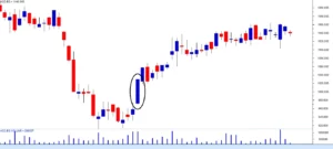
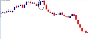
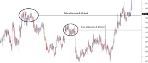
Ambuja Cements Limited’s chart is shown below. The horizontal line on the chart, which coincides with Rs.215, is Ambuja Cements’ resistance level.
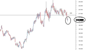
I purposefully compressed the chart to contain more data points, for reasons I will explain momentarily. But first, there are two things you should keep in mind while looking at the following chart:
A horizontal line indicates that the resistance level is greater than the current market price.
The current candle is at 206.75, while the resistance level is at 215. For your convenience, the current candle and its matching price level are surrounded.
Consider Ambuja cement at Rs.206 making a bullish marubuzo with a low of 202. We know this is a signal to start a long trade and that the stop loss for this trade is set at 202. With our newfound resistance knowledge, we can now set 215 as a feasible objective for this deal!
You may be wondering why 215? The reasons are straightforward: –
The resistance of 215 indicates that there is a possibility of excess supply.
Excess supply adds to the selling pressure.
Prices tend to fall as a result of selling pressure.
As a result, when a trader is long, he can look for resistance points to create targets and exit points for the transaction.
Furthermore, now that the resistance has been identified, the long trade may be completely designed as follows:
206 is the entry point, 202 is the stop loss, and 215 is the target.
The next apparent question is, how do we determine the level of resistance? It is quite simple to identify price points as either support or resistance. The process of identifying support and opposition is the same. If the current market price is less than the identified point, it is referred to as a resistance point; otherwise, it is referred to as a support point.
Because the approach is the same, let us begin by understanding’ support,’ and then proceed to the procedure for identifying S&R.
The support
After learning about resistance, determining the level of support should be simple and intuitive. Support, as the name implies, is something that prevents the price from falling further. The support level is a price point on the chart at which the trader anticipates the most demand (in terms of buying) for the stock/index. When the price falls below the support line, it is likely to rebound. The support level is always lower than the market price.
The price could decrease until it reaches support, then consolidate and absorb all of the demand before beginning to rise. In a declining market, one of the crucial technical levels that market players seek is support. The support is frequently used as a buy trigger.
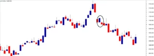
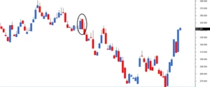
Cipla Limited’s chart is shown below. Cipla’s support level is marked on the chart by the horizontal line at 435.
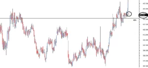
A few things to take note of in the chart above:
The horizontal line represents a support level that is lower than the current market price.
The current candle is at 442.5, while the support level is at 435. For your convenience, the current candle and its matching price level are surrounded.
As we did with resistance, imagine a bearish pattern forming – possibly a shooting star at 442 with a high of 446. With a shooting star, the call is overly short Cipla at 442, with a stop loss of 446.
We can set the aim at 435 because we know 435 is the immediate support.
A few things to take note of in the chart above:
The horizontal line represents a support level that is lower than the current market price.
The current candle is at 442.5, while the support level is at 435. For your convenience, the current candle and its matching price level are surrounded.
As we did with resistance, imagine a bearish pattern forming – possibly a shooting star at 442 with a high of 446. With a shooting star, the call is overly short Cipla at 442, with a stop loss of 446. We can set the aim at 435 because we know 435 is the immediate support.
So, what makes the Rs.435 target worthwhile? The decision is supported by the following reasons:
Support at 435 indicates that excess demand is most likely to emerge.
Excess demand increases purchasing pressure.
Buying demand tends to drive up the price.
As a result of the foregoing, when a trader is short, he can use support levels to define targets and exit points for the transaction.
Furthermore, with the identification of the support, the short trade is now fully designed.
442 is the entry point, 446 is the stop loss, and 435 is the goal.
Construction/Drawing of the support and resistance level.
Here is a four-step approach to help you locate and build the support and resistance lines.
Step 1) Stress data points – If the goal is to identify short-term S&R load, at least 3-6 months of data points should be loaded. Load at least 12 – 18 months of data points if you want to find long-term S&R. When you load a large number of data points, the chart appears compressed. This also explains why the two charts above appear squished.
Swing trading can benefit from long-term S&R.
S&R short term – beneficial for intraday and BTST trading.
I’ve imported 12 months of data points onto this chart.
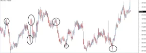
Step2) Determine at least three price action zones – A price action zone is defined as “sticky points” on the chart when the price has demonstrated at least one of the following behaviors:
After a brief uprise, I was hesitant to move up any farther.
After a brief down move, hesitating to proceed lower.
Sharp price reversals at a specific price point
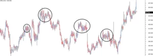
Here is a set of graphics that identify the three points mentioned above in the same order:
The circular points in the chart below suggest price is hesitant to climb higher after a quick up rise:

The circular points in the chart below reflect the price hesitant to advance lower after a quick downtrend:
The ringed points in the chart below show strong price reversals:
Step3) Align the price action zones. Many price action zones can be seen when looking at a 12-month chart. The secret, though, is to find at least three price action zones at the same price level.
Here’s an example of a chart with two price action zones that aren’t at the same price point.
Look at the chart below; I’ve circled three price action zones that are all around the same price points:
It is vital to ensure that these price action zones are well-spaced in time. This means, if the first price action zone is found in the second week of May, it will be important to identify the second price action zone at any moment after the fourth week of May. (well-spaced in time). The greater the distance between two price action zones, the more powerful the S&R identification.
Step 4) Draw a horizontal line connecting the three price activity zones. Based on where this line falls about the current market price, it becomes either support or resistance.
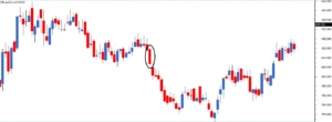
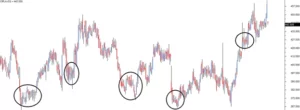
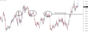
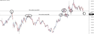
Analyze this graph.
From left to right:
The first circle denotes a price action zone with a sharp price reversal.
The second circle denotes a price action zone in which the price is sticky.
The third circle denotes a price action zone with a sharp price reversal.
The fourth circle denotes a price action zone in which the price is sticky.
The fifth circle represents Cipla’s current market price of 442.5.
In the above chart, all four price movement zones are located near the same price point, 429. The horizontal line is well below the current market price of 442.5, indicating that 429 is an immediate support price for Cipla.
Please keep in mind that whenever you perform a visual exercise in Technical Analysis, such as detecting S&R, you run the danger of approximation. As a result, always leave space for error. The price level is typically represented as a range rather than a single price point. It is a zone or area that provides support or resistance.
Following the argument outlined above, I would be content to view a price range of 426 to 432 as a support region for Cipla. There is no set guideline for this range; I simply deducted and added 3 points to 429 to achieve my support price range!
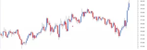
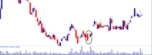
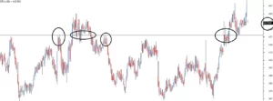
Here is another chart for Ambuja Cements Limited that shows both S&R.
Ambuja’s current price is 204.1, with support at 201 (below the current market price) and resistance at 214. (above current market price). So, if one is too short Ambuja at 204, the target can be 201 based on support. This would most likely be a good intraday trade. Based on resistance, 214 can be a plausible target expectation for a trader going long at 204.
There are at least three price action zones identified at the price level at both the support and resistance levels, all of which are well-spaced in time.
Reliability of S&R
The support and resistance lines are just indicators of a probable price reversal. They should never be taken for granted. Like anything else in technical analysis, the potential of an event occurring (based on patterns) should be weighed in terms of probability.
For example, according to the Ambuja Cements –
204 is the current market price.
214 = resistance
The anticipation is that if Ambuja cement moves up at all, it will run with resistance at 214. That is, at 214, sellers may arise, potentially dragging down prices. What guarantee do you have that the sellers will come in at 214? In other words, what is the resistance line’s dependence? To be honest, your guess is just as good as mine.
However, it can be observed in the past that anytime Ambuja reached 214, it reacted unusually, resulting in the development of a price action zone. The price activity zone is widely spread over time, which is reassuring. This means that 214 is a time-tested price action zone. Keeping the first rule of technical analysis in mind, “History tends to repeat itself,” we proceed with the expectation that support and resistance levels will be fairly honored.
S&R points that are effectively constructed are usually well respected in my trading experience.
Optimization of checklist
Perhaps we have arrived at the most critical point in this module. We will begin by learning a few optimization techniques that will assist us in identifying high-quality deals. Remember that when you pursue quality, quantity is always sacrificed, but this is a worthwhile sacrifice. The goal is to find high-quality trading signals rather than numerous but worthless trades.
In general, optimization is a strategy for fine-tuning a process to achieve the best potential results. In this case, the procedure is about identifying transactions.
Let us return to candlestick patterns, perhaps to the very first one we learned – bullish marubuzo. A bullish marubuzo indicates a long trade near the marubuzo’s close, with the low of the marubuzo acting as the stop loss.
Assume the bullish marubuzo has the following credentials:
Close = 448, Open = 432, High = 449, Low = 430
As a result, the entry point for the long trade is around 448, with 430 as the stop loss.
What if the marubuzo’s low also corresponds with reliable time-verified support? Do you notice a surprising intersection of two technical notions here?
To go far, we have a double confirmation. Consider it in the following terms:
A recognized candlestick pattern (bullish marubuzo) indicates that the trader should begin a long transaction.
Support at the stop loss price indicates to the trader that there is substantial buying demand near the bottom.
A well-crafted trading setup is essential when dealing with a fairly unpredictable environment such as the markets. The occurrence of the two conditions mentioned above (marubuzo + support at the low) implies the same action, which is to begin a long trade in this case.
This brings us to an essential point. What if we had a checklist (or, if you prefer, a framework) for every deal we considered? Before starting a trade, the checklist would serve as a guideline. The trade must adhere to the parameters outlined in the checklist. If it does, we accept the deal; otherwise, we reject it and hunt for another trade opportunity that meets the checklist.
They claim that discipline accounts for 80% of a trader’s performance. The checklist, in my opinion, forces you to be disciplined; it helps you avoid making rash and foolish trading decisions.
To begin with, we have the checklist’s first two important factors:
The stock should have a distinct candlestick pattern. a) In this subject, we learned some of the most prominent patterns. To begin, you can only use these patterns to complete the checklist.
S&R should confirm the transaction. The stop-loss price should be in the vicinity of S&R.
The low of the pattern should be near the support for a long trade.
For a short trade, the pattern’s high should be near the resistance.
From now on in this module, as and when we learn new TA concepts, we will build this checklist. But to quench your curiosity, the final checklist will have 6 checklist points. When we have the grand 6 checklist points, we will weigh down each one of them. For example, checklist point number 4 may not be as important as point number 1, but it is more important than 100 other factors that distract the trader.
Conclusion
S&R are price points on the chart
Support is a price point below the current market price that indicates buying interest.
Resistance is a price point above the current market price that indicates selling interest.
To identify S&R, place a horizontal line in such a way that it connects at least 3 price action zones, well-spaced in time. The more number of price action zones (well spaced in time) the horizontal line connects, the stronger is S&R
S&R can be used to identify targets for the trade. For a long trade, look for the immediate resistance level as the target. For a short trade, look for the immediate support level as the target.
Lastly, comply with the checklist for optimal trading results